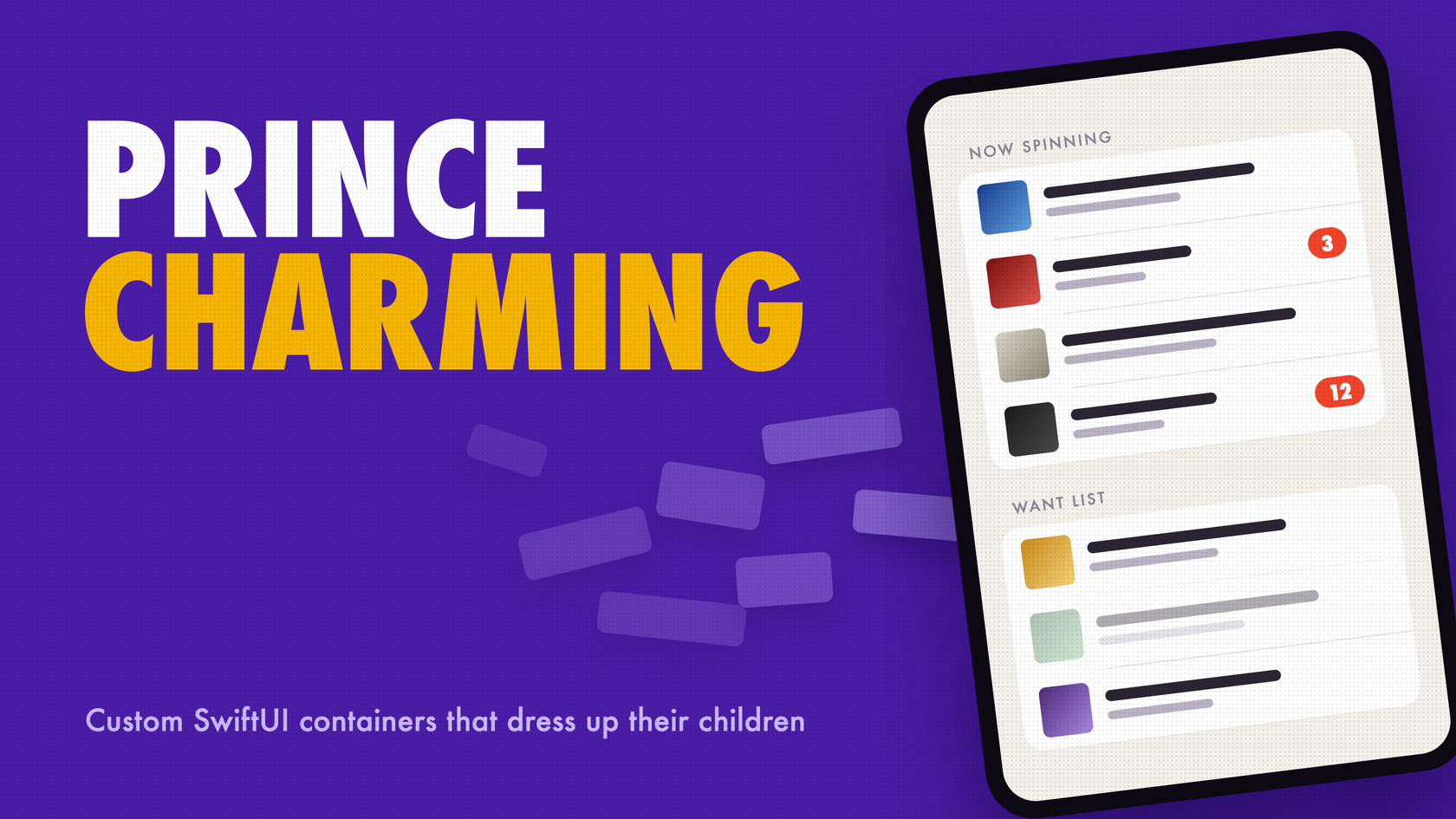
Every SwiftUI codebase I’ve worked on eventually grows a view that wants to be a List and can’t be one. In Safetied, my logbook app for aircraft mechanics, that view lives on the Today screen.
Today is a List. At compact width, the status strips and the “Needs attention” rows are ordinary List sections, one under the other. On an iPad, once the list is at least 860 points wide, the two move side by side as cards inside a single list row:
private var statusBesideAttention: some View {
    Section {
        HStack(alignment: .top, spacing: 16) {
            TodayCard(header: { statusHeader }, rows: { statusRows })
            TodayCard(header: { attentionHeader }, rows: { attentionContent })
                .animation(.snappy, value: viewModel.needsAttentionKey)
        }
        .listRowInsets(EdgeInsets())
        .listRowBackground(Color.clear)
    }
}

Same rows, two containers. On the iPad they’re two TodayCards, and on the iPhone they’re plain List sections.
The same @ViewBuilder properties, statusRows and attentionContent, feed both layouts. In the compact layout they sit inside a Section, and List gives them a lot for free: row insets, a minimum row height, a divider between rows but not after the last one, and the grouped rounded background. Inside a single list row, none of that exists. The card has to rebuild it from whatever the builder hands over, without knowing how many rows there are or what’s in them.
That’s TodayCard:
private enum TodayCardMetrics {
    static let rowInsets = EdgeInsets(top: 12, leading: 20, bottom: 12, trailing: 20)
    static let minimumRowHeight: CGFloat = 52
    static let cornerRadius: CGFloat = 26
    static let columnsMinimumWidth: CGFloat = 860
}

private struct TodayCard<Header: View, Rows: View>: View {

    init(@ViewBuilder header: () -> Header, @ViewBuilder rows: () -> Rows) {
        self.header = header()
        self.rows = rows()
    }

    var body: some View {
        VStack(alignment: .leading, spacing: 8) {
            header
                .font(.headline)
                .padding(.horizontal, TodayCardMetrics.rowInsets.leading)
            VStack(alignment: .leading, spacing: 0) {
                Group(subviews: rows) { subviews in
                    ForEach(subviews) { row in
                        row
                            .padding(TodayCardMetrics.rowInsets)
                            .frame(maxWidth: .infinity, minHeight: TodayCardMetrics.minimumRowHeight, alignment: .leading)
                        if row.id != subviews.last?.id {
                            Divider()
                                .padding(.horizontal, TodayCardMetrics.rowInsets.leading)
                        }
                    }
                }
            }
            .background(Color(.secondarySystemGroupedBackground), in: .rect(cornerRadius: TodayCardMetrics.cornerRadius))
            .clipShape(.rect(cornerRadius: TodayCardMetrics.cornerRadius))
            .buttonStyle(TodayCardRowButtonStyle())
        }
        .frame(maxWidth: .infinity, alignment: .topLeading)
    }

    private let header: Header
    private let rows: Rows
}
Three things in there are worth pointing out.
It’s the same shape as the DividedStack in the next section: a Group(subviews:), a ForEach over what it hands back, and a divider after every row except the last. The Safetied version just adds real metrics.
The card has no idea what a row is. statusRows is five ifs, and each one produces a single root. Where a strip has two lines, like the experience strip and its look-ahead, that root is a VStack. So as far as the card knows, it gets anywhere from zero to five rows, and a two-line strip still counts as one. That’s the difference between declared and resolved subviews.
.buttonStyle(TodayCardRowButtonStyle()) sits on the stack above the Group, not on row. The attention rows are Buttons, and they pick up the style because it’s set above the container, in the environment they resolve in. The style pads the label out to the row insets and then pulls that padding back with negative insets, so the pressed highlight fills the whole row instead of hugging the label:
private struct TodayCardRowButtonStyle: ButtonStyle {
    func makeBody(configuration: Configuration) -> some View {
        let insets = TodayCardMetrics.rowInsets
        configuration.label
            .frame(
                maxWidth: .infinity,
                minHeight: TodayCardMetrics.minimumRowHeight - insets.top - insets.bottom,
                alignment: .leading
            )
            .padding(insets)
            .contentShape(.rect)
            .background(Color(.systemGray4).opacity(configuration.isPressed ? 1 : 0))
            .padding(EdgeInsets(top: -insets.top, leading: -insets.leading, bottom: -insets.bottom, trailing: -insets.trailing))
    }
}
TodayCard is one case of a more general problem. A container needs to take a trailing closure full of whatever the caller feels like writing. It needs to put a divider between rows, or wrap each child in a card, or turn each child into something selectable. And the caller needs a way to say “this row has a badge” without the container knowing anything about the row.
Apple’s containers have always behaved this way. A row inside a List can hide its own separator with .listRowSeparator(.hidden). Picker takes a ForEach of plain Text views, turns them into options, and matches them against a binding with .tag(). For years, if you wanted to build that yourself, the answer was a private API or a pile of AnyView.
iOS 18 closed that gap. ForEach(subviews:), Group(subviews:), ForEach(sections:), and ContainerValues give your own containers the same kind of reach, and most iOS devs I talk to still haven’t touched them.
A while back I wrote a deep dive on the Layout protocol, with a circular layout and a flow layout. This post is the other half of that story. Layout decides where children go. The subview APIs decide what the children are and what metadata they carry. Real containers usually need both.
What We Did Before
Before iOS 18 you had two options, and neither was good.
The first was _VariadicView, the underscored machinery SwiftUI uses internally. People dug it up years ago, and it looked like this:
struct DividedStack<Content: View>: View {
    var content: Content

    init(@ViewBuilder content: () -> Content) {
        self.content = content()
    }

    var body: some View {
        _VariadicView.Tree(DividedStackRoot()) {
            content
        }
    }
}

struct DividedStackRoot: _VariadicView_MultiViewRoot {
    func body(children: _VariadicView.Children) -> some View {
        let lastID = children.last?.id
        ForEach(children) { child in
            child
            if child.id != lastID {
                Divider()
            }
        }
    }
}
It works. It also has an underscore on it, no documentation, and no promise that it survives the next SDK. Anything built on it makes beta season a little more stressful than it needs to be.
The second option was to give up on @ViewBuilder and take an array of AnyView:
struct DividedStack: View {
    let rows: [AnyView]

    var body: some View {
        VStack(spacing: 0) {
            ForEach(rows.indices, id: \.self) { index in
                rows[index]
                if index < rows.count - 1 {
                    Divider()
                }
            }
        }
    }
}
That’s public API, but look at what it costs the caller. They lose trailing-closure syntax. ForEach and if stop composing the way they do everywhere else in SwiftUI. Every child gets erased to AnyView, which hides its type from SwiftUI’s diffing, and identity becomes an array index. It’s a container that fights its own call site.
Here’s the same view with the public API:
struct DividedStack<Content: View>: View {
    @ViewBuilder var content: Content

    var body: some View {
        VStack(spacing: 0) {
            Group(subviews: content) { subviews in
                ForEach(subviews) { subview in
                    subview
                    if subview.id != subviews.last?.id {
                        Divider()
                    }
                }
            }
        }
    }
}
Same shape as the private version, no underscores, and the caller writes normal SwiftUI.
Two things to know before going further. These APIs shipped in iOS 18, macOS 15, watchOS 11, tvOS 18, and visionOS 2. My floor for new work is iOS 26, so there’s no #available dance anywhere in this post. And if you’re reading Apple’s current docs, the signatures say @ContentBuilder instead of @ViewBuilder. ContentBuilder is a typealias for ViewBuilder, so everything here works with either spelling.
Declared Views vs. Resolved Subviews
The idea that makes all of this click comes from the WWDC24 session Demystify SwiftUI containers. The views you write in a builder closure are declared subviews. What SwiftUI actually produces at runtime are resolved subviews. The subview APIs only ever hand you resolved ones.
Take this call site:
DividedStack {
    Text("Now Spinning")

    ForEach(crate.records) { record in
        RecordRow(record: record)
    }

    if crate.hasWantList {
        Text("Want List")
    }

    EmptyView()
}
That’s four declared views. With 12 records and a want list, it’s 14 resolved subviews: one for the first Text, 12 from the ForEach, one from the if, and zero from EmptyView. When hasWantList is false, the if contributes nothing. A Group with three views inside it contributes three.
This is why the container doesn’t need special cases. ForEach doesn’t show up as one child holding 12 things. It flattens into 12 individual subviews, mixed in with whatever static views sit around it. The caller can compose however they want and the container sees a flat run of children. It’s also why TodayCard can take five optional strips without a single line of code about which ones are present.
The flip side is worth knowing. A custom view whose body returns two views with no stack around them resolves to two subviews. If RecordRow returned a title Text and an artist Text side by side without a VStack, every record would turn into two rows with a divider between them. If you want a child to count as one row, give it one root. That’s exactly what the two-line strips in statusRows do.
ForEach(subviews:) or Group(subviews:)
There are two entry points, and the difference is how much the container gets to see.
ForEach(subviews:) hands you one child at a time. You don’t know how many siblings there are or where this one sits. That’s enough for a lot of containers. Wrapping each child in a card is the classic case:
struct CardStack<Content: View>: View {
    @ViewBuilder var content: Content

    var body: some View {
        VStack(spacing: 12) {
            ForEach(subviews: content) { subview in
                subview
                    .padding()
                    .frame(maxWidth: .infinity, alignment: .leading)
                    .background(Color(.secondarySystemGroupedBackground), in: .rect(cornerRadius: 16))
                    .shadow(color: .black.opacity(0.08), radius: 8, y: 2)
            }
        }
    }
}
Group(subviews:) hands you the whole thing as a SubviewsCollection. That type is a RandomAccessCollection of Subview, and it’s also a View, so you can drop the entire collection or a slice of it straight into a body. Now you have count, first, last, isEmpty, indexing, and slicing. That’s what you need once the container’s structure depends on its children as a group: the first child gets featured, the rest go in a shelf, and a footer reports the total.
struct FeaturedShelf<Content: View>: View {
    @ViewBuilder var content: Content

    var body: some View {
        Group(subviews: content) { subviews in
            if let hero = subviews.first {
                VStack(alignment: .leading, spacing: 16) {
                    hero
                        .frame(maxWidth: .infinity, minHeight: 220)
                        .background(.tint.opacity(0.12), in: .rect(cornerRadius: 20))

                    if subviews.count > 1 {
                        ScrollView(.horizontal) {
                            HStack(spacing: 12) {
                                ForEach(subviews.dropFirst()) { subview in
                                    subview
                                        .frame(width: 140, height: 140)
                                        .background(.quaternary, in: .rect(cornerRadius: 14))
                                }
                            }
                        }
                        .scrollIndicators(.hidden)
                    }

                    Text("\(subviews.count) records")
                        .font(.footnote)
                        .foregroundStyle(.secondary)
                }
            }
        }
    }
}
I use dropFirst() instead of subviews[1...] on purpose. The range subscript traps when the collection is empty, and dropFirst() just hands back an empty slice.
My rule of thumb: start with ForEach(subviews:), and move to Group(subviews:) the moment you catch yourself wanting to know about a sibling. TodayCard crossed that line for one reason, the “no divider after the last row” rule. Apple’s docs also say the collection “constructs subviews on demand, so only access the part of the collection you need.” That matters more once lazy stacks get involved, which I’ll come back to.
Subview Identity
Subview conforms to Identifiable, and its id is an opaque Subview.ID that’s Hashable. ForEach(subviews:) keys itself on that ID. It’s right there in the signature, ID == Subview.ID, and the docs say it identifies views “across updates.” In practice, the caller’s identity choices flow through. If they wrote ForEach(records) with stable IDs, inserts and removals animate the way they should, and any @State inside a row stays attached to the right record. I covered how SwiftUI uses identity to decide what changed in What the Diff?.
The easiest way to break that is in your own container code. You want a rank number next to each row, so you reach for enumerated():
ForEach(Array(subviews.enumerated()), id: \.offset) { index, subview in
    HStack(alignment: .firstTextBaseline, spacing: 12) {
        Text("\(index + 1)")
            .font(.title3.monospacedDigit().bold())
            .foregroundStyle(.secondary)
        subview
    }
}
That keys every row by its position. Remove the first record and every row’s identity shifts by one. SwiftUI sees the last row disappear and every other row change content. Transitions animate the wrong row, and per-row state slides onto the wrong record. The fix is one key path:
ForEach(Array(subviews.enumerated()), id: \.element.id) { index, subview in
    HStack(alignment: .firstTextBaseline, spacing: 12) {
        Text("\(index + 1)")
            .font(.title3.monospacedDigit().bold())
            .foregroundStyle(.secondary)
        subview
    }
}
The same trap shows up when you zip the subviews with some other array and key on the index. Key on the subview’s ID every time.
Here’s the other identity lesson: Subview.ID is the wrong tool for selection. It’s opaque. You can’t create one, persist one, or map one back to your model, so there’s no way to drive it from a binding. Selection should use values the caller controls, and SwiftUI already has a channel for that. It’s .tag(), and as of iOS 18 you can read tags through container values.
ContainerValues
Container values are keyed storage, like environment values and preferences, with a much narrower scope. The child sets a value, and only its direct container can read it.
You declare a key with @Entry in an extension on ContainerValues:
extension ContainerValues {
    @Entry var crateRowBadge: Int? = nil
    @Entry var crateRowSeparatorHidden: Bool = false
    @Entry var crateRowIsDisabled: Bool = false
}
The caller sets one with .containerValue(_:_:), which takes a writable key path and a value. Nobody wants to type .containerValue(\.crateRowBadge, 3) at a call site, so wrap each one in a modifier that reads like the rest of SwiftUI:
extension View {
    func crateRowBadge(_ count: Int?) -> some View {
        containerValue(\.crateRowBadge, count)
    }

    func crateRowSeparator(_ visibility: Visibility) -> some View {
        containerValue(\.crateRowSeparatorHidden, visibility == .hidden)
    }

    func crateRowDisabled(_ isDisabled: Bool = true) -> some View {
        containerValue(\.crateRowIsDisabled, isDisabled)
    }
}
I modeled crateRowSeparator(.hidden) on listRowSeparator(.hidden). If your container’s API feels like Apple’s, people already know how to use it.
The container reads values off each subview through subview.containerValues:
ForEach(subviews: content) { subview in
    let badge = subview.containerValues.crateRowBadge
    HStack {
        subview
        if let badge {
            Text(badge, format: .number)
        }
    }
}
ContainerValues also has tag(for:) and hasTag(_:). A .tag(value) written by the caller shows up as subview.containerValues.tag(for: Value.self). The picker below is built on that.
How this differs from environment and preferences
All three are keyed storage. The difference is which direction the value travels and who can see it.
| Direction | Who can read it | |
|---|---|---|
| Environment | Down | Every descendant |
| Preferences | Up | Any ancestor, merged through reduce |
| Container values | Up one level | Only the direct container |
Environment is for configuration that applies to a whole subtree. Preferences are for reporting things like sizes and anchors to whoever’s listening up the tree, with values from many children combined. Container values are per-child metadata for one specific parent. There’s nothing to merge, because nothing travels past that parent.
Container values never escape their container, and Apple’s docs are precise about what counts. Plain modifiers don’t block a value. The docs’ own example puts .padding() after .containerValue, and the value still gets through. A container like a VStack does stop it, and values “don’t escape a container even if the container has only one child.” I checked both cases rather than trust the docs. A value set inside an HStack, or inside a VStack with a single child, never reached the outer container.
That rule is behind the most common bug you’ll hit, and it usually shows up inside a custom row view:
struct WantListRow: View {
    let record: Record

    var body: some View {
        HStack {
            RecordRow(record: record)
                .crateRowDisabled(record.isOutOfPrint)
            Spacer()
            Image(systemName: "magnifyingglass")
        }
    }
}
The value is set on RecordRow, which sits inside an HStack. The HStack is the container that receives it and drops it. Your list never sees it. Move the modifier to the outermost view:
struct WantListRow: View {
    let record: Record

    var body: some View {
        HStack {
            RecordRow(record: record)
            Spacer()
            Image(systemName: "magnifyingglass")
        }
        .crateRowDisabled(record.isOutOfPrint)
    }
}
Same goes for callers who wrap rows in a stack for spacing. If the badge doesn’t show up, look for a stack between the modifier and your container.
Sections With ForEach(sections:)
Containers ignore Section by default. If your container has a real concept of grouped content, ForEach(sections:) and Group(sections:) let you support it. They mirror the subview APIs, but each element is a SectionConfiguration instead of a Subview.
A SectionConfiguration has an id, its own containerValues, and three SubviewsCollection properties: header, content, and footer. All three are collections, because a header can be several views. Apple’s docs recommend treating them as collections, or wrapping them in a container so they read as one unit.
Content that isn’t wrapped in a Section still gets grouped. Apple describes these as groups of sibling views that aren’t explicitly wrapped in a section. I call them implicit sections, though that’s not Apple’s term. This call site produces three sections, and the two that aren’t a Section have empty headers:
CrateList {
    Text("Recently added")

    Section("Now Spinning") {
        RecordRow(record: current)
    }

    Text("Sync settings")
}
I ran it to be sure: three sections, two empty headers. That’s why section.header.isEmpty is the check you’ll write most often. Implicit sections shouldn’t draw an empty header. And don’t assume there’s always at least one section. Empty content gave me zero.
Container values work at the section level too. Put a modifier on a Section and the value shows up twice: on the section’s own containerValues, and on every subview inside it. Section { ... }.crateRowSeparator(.hidden) hides separators for the whole group, which is how you’d write it in a List.
Group(sections:) gives you the whole SectionCollection, for the same reasons Group(subviews:) exists. Each section’s content is a SubviewsCollection, so the same advice applies inside it: only touch as much of the collection as you need.
The Worked Example: A Card Picker
Here’s a full Picker-style container. It takes a selection binding and arbitrary builder content, reads tags to match children against the binding, and reads two custom container values for a caption and an unavailable state. Selection animates with a matched-geometry highlight and plays selection haptics.
I used record grading for the example because it’s VinylCrate territory, and a condition picker has a built-in rule: Mint only makes sense if the record is still sealed.
import SwiftUI

extension ContainerValues {
    @Entry var cardPickerDetail: String? = nil
    @Entry var cardPickerIsUnavailable: Bool = false
}

extension View {
    func cardPickerDetail(_ detail: String?) -> some View {
        containerValue(\.cardPickerDetail, detail)
    }

    func cardPickerUnavailable(_ isUnavailable: Bool = true) -> some View {
        containerValue(\.cardPickerIsUnavailable, isUnavailable)
    }
}

struct CardPicker<Selection: Hashable, Content: View>: View {
    @Binding private var selection: Selection
    private let content: Content
    @Namespace private var highlight

    init(selection: Binding<Selection>, @ViewBuilder content: () -> Content) {
        _selection = selection
        self.content = content()
    }

    var body: some View {
        HStack(spacing: 8) {
            ForEach(subviews: content) { subview in
                let values = subview.containerValues
                let tag = values.tag(for: Selection.self)

                CardPickerOption(
                    isSelected: tag == selection,
                    isUnavailable: tag == nil || values.cardPickerIsUnavailable,
                    detail: values.cardPickerDetail,
                    highlight: highlight
                ) {
                    if let tag { selection = tag }
                } label: {
                    subview
                }
            }
        }
        .animation(.snappy, value: selection)
        .sensoryFeedback(.selection, trigger: selection)
    }
}
The explicit init is there so the call site reads CardPicker(selection: $grade) { ... }, exactly like Picker. It also keeps the private @Namespace out of the public surface.
Untagged children still render, but they’re disabled. I’d rather a caller see a dead card and wonder why than have content silently vanish. It also keeps the ForEach closure producing exactly one view per child.
The option view is ordinary SwiftUI:
private struct CardPickerOption<Label: View>: View {
    let isSelected: Bool
    let isUnavailable: Bool
    let detail: String?
    let highlight: Namespace.ID
    let action: () -> Void
    @ViewBuilder var label: Label

    var body: some View {
        Button(action: action) {
            VStack(spacing: 4) {
                label
                if let detail {
                    Text(detail)
                        .font(.caption)
                        .foregroundStyle(.secondary)
                }
            }
            .frame(maxWidth: .infinity, minHeight: 64)
            .padding(.horizontal, 8)
            .background {
                if isSelected {
                    RoundedRectangle(cornerRadius: 14, style: .continuous)
                        .fill(.tint.opacity(0.18))
                        .matchedGeometryEffect(id: "highlight", in: highlight)
                }
            }
            .overlay {
                RoundedRectangle(cornerRadius: 14, style: .continuous)
                    .strokeBorder(
                        isSelected ? Color.accentColor : Color.secondary.opacity(0.3),
                        lineWidth: isSelected ? 2 : 1
                    )
            }
            .contentShape(.rect(cornerRadius: 14))
        }
        .buttonStyle(.plain)
        .disabled(isUnavailable)
        .opacity(isUnavailable ? 0.45 : 1)
        .accessibilityAddTraits(isSelected ? .isSelected : [])
    }
}
Nothing in here styles label directly. That’s on purpose, and I’ll get to why in Where It Broke.
Here’s the call site, mixing a static option with a ForEach:
enum Grade: String, CaseIterable, Identifiable, Sendable {
    case mint, nearMint, veryGoodPlus, veryGood, good

    var id: Self { self }

    var shortName: String {
        switch self {
        case .mint: "M"
        case .nearMint: "NM"
        case .veryGoodPlus: "VG+"
        case .veryGood: "VG"
        case .good: "G"
        }
    }

    var summary: String {
        switch self {
        case .mint: "Sealed"
        case .nearMint: "Like new"
        case .veryGoodPlus: "Light wear"
        case .veryGood: "Audible"
        case .good: "Rough"
        }
    }
}

struct ConditionPicker: View {
    @Binding var grade: Grade
    let isSealed: Bool

    var body: some View {
        CardPicker(selection: $grade) {
            Text(Grade.mint.shortName)
                .tag(Grade.mint)
                .cardPickerDetail(Grade.mint.summary)
                .cardPickerUnavailable(!isSealed)

            ForEach(Grade.allCases.dropFirst()) { option in
                Text(option.shortName)
                    .tag(option)
                    .cardPickerDetail(option.summary)
            }
        }
        .font(.headline)
    }
}

#Preview {
    @Previewable @State var grade: Grade = .nearMint
    ConditionPicker(grade: $grade, isSealed: false)
        .padding()
}

That’s the call site above, running on an iPhone with isSealed: false. Mint is there but dead.
The static Mint card and the four ForEach cards flatten into five subviews. The container has no idea which came from where, and it doesn’t need to.
The .font(.headline) goes on the picker from outside, not on the subviews from inside. The labels resolve in the container’s environment, so a font set above the container reaches them.
The explicit .tag(option) inside the ForEach looks redundant, and it isn’t. Apple’s Picker docs say “ForEach automatically assigns a tag to the selection views using each option’s id,” so a caller could skip it. But that automatic tag is written only for the plain type. I checked with a ForEach over strings: tag(for: String.self) found the automatic tag, and tag(for: String?.self) came back nil. An explicit .tag(_:includeOptional:) writes both, because includeOptional defaults to true. So bind this picker to a Grade? and the optional lookup only works because every option has an explicit .tag. If a caller leaned on ForEach’s automatic tag and bound a Grade?, every card would come up untagged, and in this container that means dead. That’s the real reason to keep writing .tag(option).
The List-Style Version
Pickers are about selection. The other container I keep wanting is a grouped list with real per-row metadata: badges, separators that can be turned off, and a disabled state, all set by the caller. That’s the crateRow keys from earlier, plus section support. It’s also TodayCard grown up, with the caller getting a say.
struct CrateList<Content: View>: View {
    private let content: Content

    init(@ViewBuilder content: () -> Content) {
        self.content = content()
    }

    var body: some View {
        ScrollView {
            VStack(alignment: .leading, spacing: 28) {
                ForEach(sections: content) { section in
                    CrateListSection(section: section)
                }
            }
            .padding(16)
        }
        .background(Color(.systemGroupedBackground))
    }
}

private struct CrateListSection: View {
    let section: SectionConfiguration

    var body: some View {
        VStack(alignment: .leading, spacing: 8) {
            if !section.header.isEmpty {
                VStack(alignment: .leading) { section.header }
                    .padding(.horizontal, 16)
            }

            VStack(spacing: 0) {
                ForEach(section.content) { row in
                    CrateRow(
                        row: row,
                        showsSeparator: row.id != section.content.last?.id
                            && !row.containerValues.crateRowSeparatorHidden
                    )
                }
            }
            .background(Color(.secondarySystemGroupedBackground), in: .rect(cornerRadius: 16))

            if !section.footer.isEmpty {
                VStack(alignment: .leading) { section.footer }
                    .padding(.horizontal, 16)
            }
        }
    }
}

private struct CrateRow: View {
    let row: Subview
    let showsSeparator: Bool

    var body: some View {
        let values = row.containerValues

        HStack(spacing: 12) {
            row
                .frame(maxWidth: .infinity, alignment: .leading)

            if let badge = values.crateRowBadge {
                Text(badge, format: .number)
                    .font(.caption.weight(.semibold).monospacedDigit())
                    .padding(.horizontal, 8)
                    .padding(.vertical, 2)
                    .foregroundStyle(.white)
                    .background(.tint, in: .capsule)
            }
        }
        .padding(.horizontal, 16)
        .padding(.vertical, 12)
        .opacity(values.crateRowIsDisabled ? 0.4 : 1)
        .allowsHitTesting(!values.crateRowIsDisabled)
        .overlay(alignment: .bottom) {
            if showsSeparator {
                Divider()
                    .padding(.leading, 16)
            }
        }
    }
}
Each section’s header and footer go inside a VStack, so a multi-view header stays together as one unit, which is what Apple’s SectionConfiguration docs recommend. The separator is an overlay on the row, not a sibling view, so the ForEach still produces one view per row. And the disabled state uses .allowsHitTesting(false) plus dimming rather than .disabled().
The call site reads like a List:
struct Record: Identifiable, Sendable {
    let id: UUID
    let artist: String
    let title: String
    let playCount: Int
    let isOutOfPrint: Bool
}

struct RecordRow: View {
    let record: Record

    var body: some View {
        VStack(alignment: .leading, spacing: 2) {
            Text(record.title)
                .font(.body.weight(.medium))
            Text(record.artist)
                .font(.subheadline)
                .foregroundStyle(.secondary)
        }
    }
}

struct CrateHomeView: View {
    let nowSpinning: [Record]
    let wantList: [Record]
    let unsyncedCount: Int

    var body: some View {
        CrateList {
            Section {
                ForEach(nowSpinning) { record in
                    RecordRow(record: record)
                        .crateRowBadge(record.playCount > 0 ? record.playCount : nil)
                }
            } header: {
                Text("Now Spinning")
                    .font(.footnote.weight(.semibold))
                    .foregroundStyle(.secondary)
                    .textCase(.uppercase)
            }

            Section {
                ForEach(wantList) { record in
                    RecordRow(record: record)
                        .crateRowDisabled(record.isOutOfPrint)
                }
            } header: {
                Text("Want List")
                    .font(.footnote.weight(.semibold))
                    .foregroundStyle(.secondary)
                    .textCase(.uppercase)
            } footer: {
                Text("Out-of-print pressings stay on the list so you remember to dig for them.")
                    .font(.footnote)
                    .foregroundStyle(.secondary)
            }
            .crateRowSeparator(.hidden)

            Label("Sync to iCloud", systemImage: "icloud")
                .crateRowBadge(unsyncedCount > 0 ? unsyncedCount : nil)
        }
    }
}

The row cards use secondarySystemGroupedBackground, the same color a grouped List uses for its cells. My first pass used .background(.background), which looks fine in light mode. In dark mode it’s black on the black grouped background, and the cards disappear, leaving only floating dividers.
The Label at the end isn’t in a Section, so it becomes its own implicit section with no header. RecordRow has a single VStack root, so each record is one row. The separator modifier on the want-list Section reaches every row inside it.
The header styling lives at the call site. That’s not my favorite API, since List styles headers for you. If you want that, the clean move is a section-level container value carrying a title string, so the container renders its own styled Text and doesn’t need to restyle someone else’s view.
Reading the Same Values From a Layout
This is where the two halves of the story meet. As of iOS 18, LayoutSubview has a containerValues property too. The keys you declare for a subview-based container also work in a custom Layout. That’s a cleaner replacement for the LayoutValueKey approach from the Layout post, as long as your floor is iOS 18 or later.
extension ContainerValues {
    @Entry var isPinned: Bool = false
}

struct PinnedFirstStack: Layout {
    var spacing: CGFloat = 8

    func sizeThatFits(proposal: ProposedViewSize, subviews: Subviews, cache: inout ()) -> CGSize {
        let sizes = subviews.map { $0.sizeThatFits(ProposedViewSize(width: proposal.width, height: nil)) }
        let totalSpacing = spacing * CGFloat(max(subviews.count - 1, 0))
        let height = sizes.map(\.height).reduce(0, +) + totalSpacing
        let width = proposal.width ?? sizes.map(\.width).max() ?? 0
        return CGSize(width: width, height: height)
    }

    func placeSubviews(in bounds: CGRect, proposal: ProposedViewSize, subviews: Subviews, cache: inout ()) {
        let ordered = subviews.filter { $0.containerValues.isPinned }
            + subviews.filter { !$0.containerValues.isPinned }

        var y = bounds.minY
        for subview in ordered {
            let size = subview.sizeThatFits(ProposedViewSize(width: bounds.width, height: nil))
            subview.place(
                at: CGPoint(x: bounds.minX, y: y),
                anchor: .topLeading,
                proposal: ProposedViewSize(width: bounds.width, height: size.height)
            )
            y += size.height + spacing
        }
    }
}
A container can use both at once. Run ForEach(subviews:) to wrap each child in its row chrome, and place the result inside a custom Layout that reads the same container values to decide position. The WWDC24 session’s display board is a version of this: a custom layout scatters the cards, and the ForEach inside it reads each subview’s container values to decide how its card looks.
Where It Broke
Environment modifiers on a subview don’t reach the view
This is the one most likely to cost you an afternoon. Apple’s Subview docs say modifiers on the original view apply before modifiers on the subview, and that the view is resolved “using the environment of its container”, not the environment of the subview proxy. So environment values you set on subview inside your container don’t reach the view it stands for. That covers .font, .foregroundStyle, and anything else that works through the environment. There’s a developer forums thread from someone who set environment values inside Group(subviews:) and found they never reached the subviews. Apple’s answer is that it’s working as intended.
Layout and drawing modifiers like .padding, .frame, .background, and .overlay work fine, because they wrap the proxy instead of trying to change how it resolves. That’s why TodayCard can pad and frame row directly but sets its button style on the stack above the Group. It’s also why CardPickerOption never styles label, and why the .font(.headline) sits outside the picker.
.disabled() is the sneaky one, because it works through the environment too. I ran this one as well. .disabled() on the proxy left isEnabled true inside the child, and .font on the proxy left the child’s font unset. So disabling the proxy doesn’t disable a Button inside the caller’s row. CrateRow uses .allowsHitTesting(false) and dims the row instead. The other direction holds up too: .disabled() at the call site works, and a font set above the container reaches the child. If the caller’s row has its own controls that need a real disabled state, they should put .disabled() on the row at the call site, where it applies to the original view.
The docs also warn that a subview may represent a view after its styles have already been applied, so setting a style on the subview may not do anything. Same lesson: style at the call site or above the container, the way TodayCard does with its button style.
Container values don’t survive a wrapper
It’s the bug you’ll file against yourself most often. If a value goes missing, look for a stack between the modifier and the container. Custom row views are the usual suspect.
Lazy containers want one view per child
Lazy stacks address their children by index, so they need to know how many views each element produces. The WWDC26 session Dive into lazy stacks and scrolling with SwiftUI is direct about it. When every element resolves to exactly one view, the count is obvious. In the session’s words, “It doesn’t have to construct views to compute view counts or indices.” When a view in a ForEach resolves to a varying number of views, the lazy stack has to construct views just to work out counts and indices, and it can keep them alive longer than you’d expect.
That rule applies twice in a custom container. It applies to your callers: a row view with an if in its body, or an if in the ForEach closure, makes each element produce one row or zero. And it applies to your own ForEach(subviews:) closure. TodayCard emits row and then, for every row but the last, a Divider. That’s one or two views per child, and DividedStack has the same shape. It’s fine in both, because both are plain VStacks. In a LazyVStack, it’s exactly the shape that session tells you to avoid.
The lazy version keeps it to one view per child:
struct LazyDividedList<Content: View>: View {
    @ViewBuilder var content: Content

    var body: some View {
        ScrollView {
            LazyVStack(spacing: 0) {
                ForEach(subviews: content) { subview in
                    subview
                        .padding(.horizontal, 16)
                        .padding(.vertical, 12)
                        .frame(maxWidth: .infinity, alignment: .leading)
                        .overlay(alignment: .bottom) {
                            Divider()
                                .padding(.leading, 16)
                        }
                }
            }
        }
    }
}
The last row gets a divider too, and that’s a trade I made on purpose. Skipping the divider on the last row means asking the collection for its end. Apple documents that SubviewsCollection builds subviews on demand, but I haven’t seen them document what count or last costs inside a lazy stack when the caller’s content has a dynamic shape. I’d rather not learn that in production. If you need that kind of whole-collection logic in a lazy container, measure it with an onAppear print or Instruments before trusting it. The -LogForEachSlowPath YES launch argument, covered in this Nil Coalescing post, logs when a ForEach drops off the fast path.
Sections work well here. Put ForEach(sections:) inside a LazyVStack and have each section return a single VStack, and the lazy stack sees one child per section. Sections load lazily as you scroll, but the rows inside each section’s VStack load all at once. For a handful of grouped sections that’s the right trade. For thousands of rows in one section, it isn’t. I covered more of the lazy side in Tuning Lazy Stacks and Grids in SwiftUI.
Old code uses the beta names
The WWDC24 session and its sample code use the older names: ForEach(subviewOf:), Group(subviewsOf:), and ForEach(sectionOf:). The shipping API is subviews: and sections:. If you’re copying from a 2024 blog post and nothing compiles, that’s probably why.
Identity, one more time
Key on subview.id. Never key on offsets. Never use the subview ID as a selection value. Use tags.
Still on the List
One thing in iOS 26 I haven’t used yet: Subview.ContainerSizingOptions, an enum with .uniform(axis:) and .variable cases. As far as I can find, nothing public in the SDK takes it as a parameter yet. I’m watching for whatever does.
The bigger lesson is about the call site. The decisions in CardPicker and CrateList I’m happiest with all started from what the caller has to write: modifiers that look like listRowSeparator, tags that work like Picker, and sections that behave like List. Once the call site was right, the container code was the easy part.
TodayCard is the smallest version of that. The rows in statusRows have no idea whether they’re in a Section or a card, and they shouldn’t have to.
Between Layout and the subview APIs, you can build the kind of container Apple used to keep for itself, and none of it needs an underscore.