Most iPad apps are embarrassing.
You install something promising from the App Store, open it on your iPad, and what do you get? A comically wide iPhone. Two columns of whitespace flanking a narrow content lane. Navigation that clearly made no decision about whether this is supposed to be a split view or a tab bar — so it’s just both, sort of, with nothing quite fitting. The developer shipped an iPad target because the checkbox was there. That’s it.
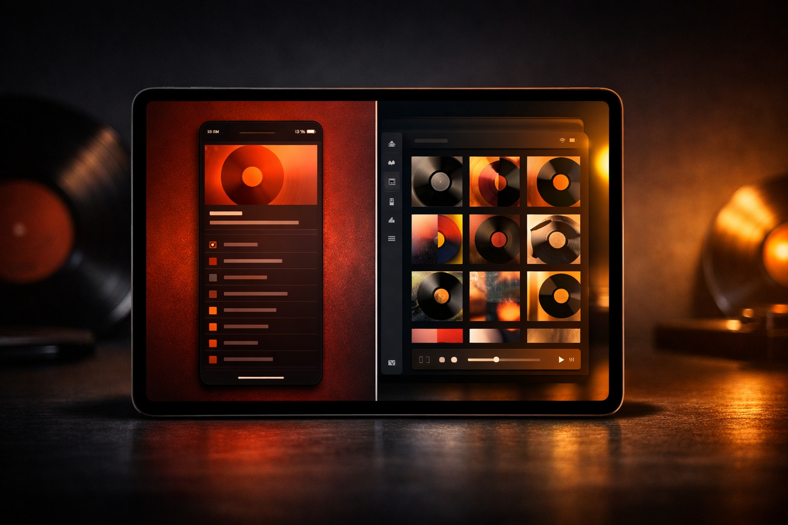
I built VinylCrate — a vinyl collection manager with album grids, crate browsing, playback controls, and a persistent mini-player — and I knew early that shipping “it runs on iPad” wasn’t going to cut it. Collectors use this app on everything. iPhone on the couch, iPad at the record store, split view while watching something. The layout challenges compound fast: grids that need different column counts at different sizes, a mini-player that attaches differently to tablet navigation than phone tab bars, deep navigation stacks that should remember where you were when you come back. None of that solved itself.
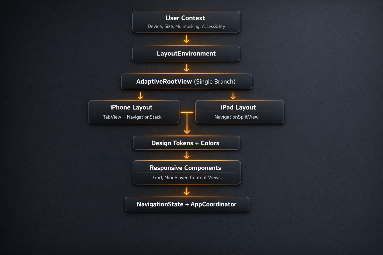
The fix isn’t one clever trick. It’s five architectural layers that compose: a richer layout environment model, a single early branch point, a token-based design system, a responsive grid configuration, and per-tab navigation state. Each layer does one thing. Together they cover the cases that break most apps.
Here’s how I built it.
The Architecture at a Glance
Stop Using horizontalSizeClass as Your Only Signal
horizontalSizeClass is useful. It’s also wildly insufficient as your sole branching signal.
The problem is the compression. You get two buckets — .compact and .regular — and they’re supposed to represent the full spectrum of contexts your app runs in. They don’t. An iPhone 16 Pro Max in landscape is .regular. An iPad in full-screen is .regular. An iPad running in a 1/3 split view is .compact. Same as an iPhone SE portrait. These are meaningfully different contexts that your layout probably needs to handle differently, and a single Boolean collapses them all.
The split view case is the one that ships broken most often. Here’s what it looks like in production: a user opens your app in 1/3 split view on their iPad, and your five-column grid — tuned for full-screen iPad — tries to render in a window barely wider than an iPhone SE. Album art clips. Tap targets overlap. Labels truncate to a single character. The user assumes the app is broken. You pull up your test device, open the app in full-screen, and everything looks fine. You close the ticket. A week later, the review drops: “Terrible on iPad.” You still can’t reproduce it because you never test Split View. The size class reports .compact the whole time, same as it always has, and your layout did exactly what you told it to do.
In VinylCrate, I replaced the raw size class check with a richer LayoutEnvironment enum:
enum LayoutEnvironment {
    case iPhonePortrait
    case iPhoneLandscape
    case iPadFullscreen
    case iPadSplitView
    case iPadSlideOver

    init(horizontalSizeClass: UserInterfaceSizeClass?,
         verticalSizeClass: UserInterfaceSizeClass?,
         containerWidth: CGFloat) {
        switch (horizontalSizeClass, verticalSizeClass) {
        case (.compact, .compact):
            self = .iPhoneLandscape
        case (.compact, .regular):
            // Both iPhone portrait and iPad in multitasking report (.compact, .regular).
            // Container width breaks the tie: the widest iPhone in portrait is ~430pt
            // (iPhone 16 Plus / Pro Max). Anything wider in this size class pair is iPad.
            self = containerWidth > 430 ? .iPadSplitView : .iPhonePortrait
        case (.regular, .compact):
            self = .iPadSplitView
        case (.regular, .regular):
            self = .iPadFullscreen
        default:
            self = .iPhonePortrait
        }
    }

    var isIPad: Bool {
        switch self {
        case .iPadFullscreen, .iPadSplitView, .iPadSlideOver: return true
        default: return false
        }
    }

    var isCompact: Bool {
        switch self {
        case .iPhonePortrait, .iPhoneLandscape, .iPadSplitView, .iPadSlideOver: return true
        case .iPadFullscreen: return false
        }
    }
}
The (.compact, .regular) pair is the genuinely ambiguous case — both iPhone portrait and iPad in multitasking report it. Container width is what breaks the tie. The widest iPhone in portrait today is the iPhone 16 Plus and Pro Max at 430pt. If the reported size class is .compact/.regular and the container is wider than that, you’re on an iPad. GeometryReader in the modifier makes that width available at the moment the environment value is constructed — which is why the measurement happens there rather than in the enum itself.
To make this available everywhere without prop drilling, I wired it into a custom environment key:
private struct LayoutEnvironmentKey: EnvironmentKey {
    static let defaultValue: LayoutEnvironment = .iPhonePortrait
}

extension EnvironmentValues {
    var layoutEnvironment: LayoutEnvironment {
        get { self[LayoutEnvironmentKey.self] }
        set { self[LayoutEnvironmentKey.self] = newValue }
    }
}

extension View {
    func withAdaptiveLayout() -> some View {
        modifier(AdaptiveLayoutModifier())
    }
}

struct AdaptiveLayoutModifier: ViewModifier {
    @Environment(\.horizontalSizeClass) var horizontalSizeClass
    @Environment(\.verticalSizeClass) var verticalSizeClass

    func body(content: Content) -> some View {
        GeometryReader { proxy in
            let environment = LayoutEnvironment(
                horizontalSizeClass: horizontalSizeClass,
                verticalSizeClass: verticalSizeClass,
                containerWidth: proxy.size.width
            )
            content.environment(\.layoutEnvironment, environment)
        }
    }
}
Apply .withAdaptiveLayout() once at the root. From that point forward, any view that cares about layout context reads @Environment(\.layoutEnvironment) and gets a meaningful value — not a size class boolean to interpret manually.
Branch Early, Branch Once
The alternative to a clean branch point is if horizontalSizeClass == .regular scattered across every view that has layout opinions. You add one in the grid. Another in the navigation. A third in the player controls. Six months later, you’re changing how the sidebar behaves and you’re grepping through 40 files to find every place that made a layout decision.
The discipline is simple: make the iPad vs. iPhone decision once, at the root, and let everything downstream stay clean.
In AdaptiveRootView, the top-level body does exactly one thing:
struct AdaptiveRootView: View {
    @Environment(\.layoutEnvironment) var layoutEnvironment
    @State private var navigationState = NavigationState()

    var body: some View {
        if layoutEnvironment.isIPad {
            iPadLayout
        } else {
            iPhoneLayout
        }
    }
}
The iPad layout uses NavigationSplitView with a sidebar and a per-tab detail stack:
private var iPadLayout: some View {
    NavigationSplitView {
        List(Tab.allCases, selection: $navigationState.selectedTab) { tab in
            Label(tab.title, systemImage: tab.icon)
                .tag(tab)
        }
        .listStyle(.sidebar)
        .navigationTitle("VinylCrate")
    } detail: {
        NavigationStack(path: navigationState.currentPath) {
            selectedTabRootView
                .navigationDestination(for: Route.self) { route in
                    RouteView(route: route)
                }
        }
    }
}
The iPhone layout uses the new Tab() API with scroll-aware minimization:
private var iPhoneLayout: some View {
    TabView(selection: $navigationState.selectedTab) {
        Tab(Tab.collection.title, systemImage: Tab.collection.icon, value: Tab.collection) {
            NavigationStack(path: navigationState.pathBinding(for: .collection)) {
                CollectionView()
            }
        }
        Tab(Tab.crates.title, systemImage: Tab.crates.icon, value: Tab.crates) {
            NavigationStack(path: navigationState.pathBinding(for: .crates)) {
                CratesView()
            }
        }
        Tab(Tab.discover.title, systemImage: Tab.discover.icon, value: Tab.discover) {
            NavigationStack(path: navigationState.pathBinding(for: .discover)) {
                DiscoverView()
            }
        }
    }
    .tabBarMinimizeBehavior(.onScrollDown)
    .modifier(ConditionalBottomAccessoryModifier())
}
That .modifier(ConditionalBottomAccessoryModifier()) deserves a note. The tabViewBottomAccessory modifier in iOS 18+ attaches a view to the bottom of the tab bar — perfect for a persistent mini-player. But if you attach an empty view there unconditionally, you get a blank Liquid Glass bar floating above your content. The modifier handles the conditional:
struct ConditionalBottomAccessoryModifier: ViewModifier {
    @EnvironmentObject var playerState: PlayerState

    func body(content: Content) -> some View {
        if playerState.hasActiveTrack {
            content.tabViewBottomAccessory {
                MiniPlayerAccessory()
            }
        } else {
            content
        }
    }
}
The MiniPlayerAccessory itself uses ViewThatFits to adapt to whatever width it actually has — no placement enum, no manual size class check:
struct MiniPlayerAccessory: View {
    @EnvironmentObject var playerState: PlayerState

    var body: some View {
        ViewThatFits(in: .horizontal) {
            ExpandedMiniPlayer(track: playerState.currentTrack)
            CompactMiniPlayer(track: playerState.currentTrack)
        }
    }
}
ViewThatFits tries each child in order and picks the first one that fits without truncation or clipping. In a full-width tab bar on iPhone, ExpandedMiniPlayer fits — album art, track title, artist, playback controls. In a narrower context (landscape iPhone, iPad in split view), it falls back to CompactMiniPlayer — just art and the play/pause button. The decision is made by the layout system against real geometry, not by a semantic label you have to interpret. It’s the right tool for any view that has a “preferred” layout and a “minimum viable” fallback.
This is the setlist discipline: decide the structure once, then execute cleanly. Metallica doesn’t scatter “Master of Puppets” across three different spots in the set and hope it adds up to something coherent. One moment, full commitment, everything else organized around it.
Colors That Don’t Fight the OS
Hard-coded RGB values are a debt you pay at midnight when a user screenshots your app in dark mode and it looks broken. The platform handles dark mode, high contrast, and wide color gamut — in Xcode’s asset catalog, where that logic belongs.
The before state is familiar:
// Please don't do this
Color(red: 0.18, green: 0.12, blue: 0.08)
In VinylCrate, every color is a named reference from the asset catalog:
enum AppColors {
    // Warm Analog palette — aged album sleeves, amber lighting, wooden crates
    static let warmAmber = Color("WarmAmber")
    static let deepGroove = Color("DeepGroove")
    static let vinylBlack = Color("VinylBlack")
    static let sleeveWhite = Color("SleeveWhite")
    static let crateWood = Color("CrateWood")

    // Semantic surface colors
    static let primaryBackground = Color("PrimaryBackground")
    static let secondaryBackground = Color("SecondaryBackground")
    static let tertiaryBackground = Color("TertiaryBackground")

    // Text hierarchy
    static let primaryText = Color("PrimaryText")
    static let secondaryText = Color("SecondaryText")
    static let placeholderText = Color("PlaceholderText")

    // Interactive
    static let accent = Color("AccentColor")
    static let accentSubtle = Color("AccentSubtle")
    static let destructive = Color("DestructiveRed")

    // Playback indicators
    static let nowPlayingGlow = Color("NowPlayingGlow")
    static let waveformActive = Color("WaveformActive")
    static let waveformInactive = Color("WaveformInactive")
}
What you get for free: Xcode manages the dark/light appearance, the high-contrast variants, and the P3 vs. sRGB rendering. You write AppColors.warmAmber once. The OS does the right thing everywhere.
The “Warm Analog” palette isn’t arbitrary — vinyl has a specific aesthetic. Aged paper, amber lighting, the deep brown of a wooden crate, the near-black of a record itself. These colors live in the asset catalog with appearances tuned so the warm amber reads correctly in both a bright record store and a dark listening room.
A Design System That Scales With Your App
padding(.trailing, 20). frame(width: 50). cornerRadius(12). These are magic numbers, and every one of them is future tech debt. Six months later when your designer says “can we tighten the spacing and make the corner radius a bit softer?”, you’re making changes in 40 places and hoping you didn’t miss any.
Tokens win. The implementation is unexciting. The maintenance story is not.
enum Spacing {
    static let xxSmall: CGFloat = 2
    static let xSmall: CGFloat = 4
    static let small: CGFloat = 8
    static let medium: CGFloat = 16
    static let large: CGFloat = 24
    static let xLarge: CGFloat = 32
    static let xxLarge: CGFloat = 48

    // iPad-specific
    static let iPadHorizontalPadding: CGFloat = 40
    static let iPadSidebarWidth: CGFloat = 280
    static let iPadContentMaxWidth: CGFloat = 900
    static let iPadGridGutter: CGFloat = 20
}

enum FontSize {
    static let caption: CGFloat = 11
    static let footnote: CGFloat = 13
    static let subheadline: CGFloat = 15
    static let body: CGFloat = 17
    static let headline: CGFloat = 17
    static let title3: CGFloat = 20
    static let title2: CGFloat = 22
    static let title: CGFloat = 28
    static let largeTitle: CGFloat = 34

    // iPad display sizes
    static let iPadHeroTitle: CGFloat = 48
    static let iPadSectionHeader: CGFloat = 24
}

enum CornerRadius {
    static let small: CGFloat = 6
    static let medium: CGFloat = 12
    static let large: CGFloat = 16
    static let xLarge: CGFloat = 24
    static let pill: CGFloat = 999
}

enum IconSize {
    static let small: CGFloat = 16
    static let medium: CGFloat = 24
    static let large: CGFloat = 32
    static let xLarge: CGFloat = 44
    static let hero: CGFloat = 64
}

enum ImageSize {
    static let albumThumbnail: CGFloat = 48
    static let albumListItem: CGFloat = 60
    static let albumGrid: CGFloat = 150
    static let albumGridIPad: CGFloat = 200
    static let albumDetail: CGFloat = 320
    static let albumDetailIPad: CGFloat = 480
    static let heroImage: CGFloat = 240
}
VinylCrate runs on iOS 26, so there’s a Liquid Glass layer on top of this:
enum LiquidGlassConstants {
    static let defaultBlurRadius: CGFloat = 20
    static let subtleBlurRadius: CGFloat = 12
    static let heavyBlurRadius: CGFloat = 40
    static let defaultOpacity: CGFloat = 0.7
    static let glassSpring = Spring(duration: 0.5, bounce: 0.2)
    static let responsiveSpring = Spring(duration: 0.3, bounce: 0.1)
    static let slowSpring = Spring(duration: 0.8, bounce: 0.15)
}
Note for verification: Confirm
LiquidGlassConstantsnaming is stable in the shipping SDK — beta names sometimes change before release.
The .liquidGlass() view extension composes these tokens so callsites stay clean:
extension View {
    func liquidGlass(
        blurRadius: CGFloat = LiquidGlassConstants.defaultBlurRadius,
        opacity: CGFloat = LiquidGlassConstants.defaultOpacity,
        cornerRadius: CGFloat = CornerRadius.large
    ) -> some View {
        self
            .background(
                RoundedRectangle(cornerRadius: cornerRadius)
                    .fill(.ultraThinMaterial)
                    .opacity(opacity)
            )
            .clipShape(RoundedRectangle(cornerRadius: cornerRadius))
    }
}
Token systems feel like overhead until you need to make a change. Then they feel like the best decision you ever made.
Grids That Respond to Their Container
Hard-coded column counts are a category of mistake. LazyVGrid(columns: [GridItem(), GridItem(), GridItem()]) works until you test it in an iPad split view and realize three columns in a narrow container looks worse than two. You fix the split view case. Then you discover you broke the landscape iPhone case. Then you add another branch. Now you have layout logic scattered across your view.
The cleaner pattern: extract the configuration and let the grid query it.
struct ResponsiveGridConfiguration {
    let columns: Int
    let spacing: CGFloat
    let itemAspectRatio: CGFloat

    var gridItems: [GridItem] {
        Array(repeating: GridItem(.flexible(), spacing: spacing), count: columns)
    }

    static func forCollectionGrid(environment: LayoutEnvironment) -> ResponsiveGridConfiguration {
        switch environment {
        case .iPhonePortrait:
            return ResponsiveGridConfiguration(columns: 2, spacing: Spacing.small, itemAspectRatio: 1.0)
        case .iPhoneLandscape:
            return ResponsiveGridConfiguration(columns: 3, spacing: Spacing.small, itemAspectRatio: 1.0)
        case .iPadSplitView:
            // Narrower than portrait — don't assume regular width
            return ResponsiveGridConfiguration(columns: 3, spacing: Spacing.medium, itemAspectRatio: 1.0)
        case .iPadSlideOver:
            return ResponsiveGridConfiguration(columns: 2, spacing: Spacing.small, itemAspectRatio: 1.0)
        case .iPadFullscreen:
            return ResponsiveGridConfiguration(columns: 5, spacing: Spacing.iPadGridGutter, itemAspectRatio: 1.0)
        }
    }
}
Usage in CollectionScrollView is straightforward:
struct CollectionScrollView: View {
    @Environment(\.layoutEnvironment) var layoutEnvironment
    let albums: [Album]

    private var gridConfig: ResponsiveGridConfiguration {
        .forCollectionGrid(environment: layoutEnvironment)
    }

    var body: some View {
        ScrollView {
            LazyVGrid(columns: gridConfig.gridItems, spacing: gridConfig.spacing) {
                ForEach(albums) { album in
                    AlbumGridCell(album: album)
                        .aspectRatio(gridConfig.itemAspectRatio, contentMode: .fit)
                }
            }
            .padding(.horizontal, layoutEnvironment.isIPad ? Spacing.iPadHorizontalPadding : Spacing.medium)
        }
    }
}
Notice .iPadSplitView gets 3 columns — the same as iPhone landscape. That’s intentional. iPad in 1/3 split view is genuinely narrow. Giving it 5 columns because “it’s an iPad” would be the same mistake as ignoring the size class entirely, just in the other direction. The five-state model exists precisely to handle this.
Navigation That Remembers Where It Was
The classic bug: open Discover, navigate three levels deep into a genre → artist → album. Tap Home. Tap Discover again. Stack is gone. Scroll position is gone. You’re back at the root.
Users notice this. It’s not a subtle UX detail — it’s the kind of thing that makes an app feel unpolished in a way that’s hard to articulate but easy to feel.
The fix is per-tab NavigationPath with a coordinator that owns the state:
@Observable
class NavigationState {
    var selectedTab: Tab = .collection
    var homePath: NavigationPath = NavigationPath()
    var cratesPath: NavigationPath = NavigationPath()
    var discoverPath: NavigationPath = NavigationPath()
    var searchPath: NavigationPath = NavigationPath()

    func setPath(_ path: NavigationPath, for tab: Tab) {
        switch tab {
        case .collection: homePath = path
        case .crates:     cratesPath = path
        case .discover:   discoverPath = path
        case .search:     searchPath = path
        }
    }

    var currentPath: Binding<NavigationPath> {
        pathBinding(for: selectedTab)
    }

    func pathBinding(for tab: Tab) -> Binding<NavigationPath> {
        Binding(
            get: {
                switch tab {
                case .collection: return self.homePath
                case .crates:     return self.cratesPath
                case .discover:   return self.discoverPath
                case .search:     return self.searchPath
                }
            },
            set: { self.setPath($0, for: tab) }
        )
    }
}
Navigation actions flow through AppCoordinator rather than being scattered in views:
@Observable
class AppCoordinator {
    var navigationState: NavigationState
    var presentedSheet: Route?

    func navigate(to route: Route, on tab: Tab? = nil) {
        let targetTab = tab ?? route.preferredTab ?? navigationState.selectedTab

        if route.isSheet {
            presentedSheet = route
        } else {
            if navigationState.selectedTab != targetTab {
                navigationState.selectedTab = targetTab
            }
            var path = navigationState.pathBinding(for: targetTab).wrappedValue
            path.append(route)
            navigationState.setPath(path, for: targetTab)
        }
    }

    func presentSheet(_ route: Route) {
        presentedSheet = route
    }

    func switchTab(to tab: Tab) {
        navigationState.selectedTab = tab
    }

    func dismissSheet() {
        presentedSheet = nil
    }
}
The Route enum separates push routes from sheet routes cleanly:
enum Route: Hashable {
    // Push routes
    case albumDetail(Album)
    case artistDetail(Artist)
    case genreDetail(Genre)
    case crateDetail(Crate)
    case playbackHistory

    // Sheet routes
    case addToCrate(Album)
    case editAlbum(Album)
    case settings
    case nowPlaying

    var isSheet: Bool {
        switch self {
        case .addToCrate, .editAlbum, .settings, .nowPlaying: return true
        default: return false
        }
    }

    var preferredTab: Tab? {
        switch self {
        case .albumDetail, .playbackHistory: return .collection
        case .crateDetail: return .crates
        case .artistDetail, .genreDetail: return .discover
        default: return nil
        }
    }
}
Deep link handling routes through the same coordinator. There’s no separate URL parsing layer, no views reaching into each other’s navigation state. A deep link arrives, gets translated to a Route, and AppCoordinator.navigate(to:) handles placement, tab switching, and path management in one place.
Transitions Worth Noticing
A zoom transition on album art feels earned in a vinyl app. The record expands from the grid cell into the detail view — there’s a natural visual logic to it, like pulling an album off a shelf. When it works cleanly, it’s the kind of detail that makes the app feel crafted.
The implementation uses matchedGeometryEffect with a context suffix to avoid collisions when the same album appears in multiple grids simultaneously:
struct HeroImageModifier: ViewModifier {
    let album: Album
    let context: String
    var namespace: Namespace.ID

    var geometryID: String {
        "\(album.id.uuidString)-\(context)"
    }

    func body(content: Content) -> some View {
        content
            .matchedGeometryEffect(id: geometryID, in: namespace)
    }
}
The zoom navigation transition in AdaptiveRootView:
private func applyTransition(to view: some View, for album: Album) -> some View {
    view.navigationTransition(
        .zoom(sourceID: "\(album.id.uuidString)-collection", in: heroNamespace)
    )
}
That context suffix matters. An album can appear in your collection grid, a crate view, and a “Recently Added” section at the same time. Without the suffix, multiple geometry sources compete and the transition behaves unpredictably.
The reduce motion check is not optional:
struct RecordPlayerView: View {
    @Environment(\.accessibilityReduceMotion) var reduceMotion

    var body: some View {
        ZStack {
            RecordImage()
                .rotationEffect(isPlaying ? .degrees(spinAngle) : .zero)
                .animation(
                    reduceMotion ? nil : .linear(duration: 2.0).repeatForever(autoreverses: false),
                    value: isPlaying
                )

            TonearmView()
                .rotationEffect(isPlaying ? .degrees(22) : .degrees(0))
                .animation(
                    reduceMotion ? .easeInOut(duration: 0.3) : .spring(LiquidGlassConstants.glassSpring),
                    value: isPlaying
                )
        }
    }
}
And in PlaybackControlsView:
struct PlaybackControlsView: View {
    @Environment(\.accessibilityReduceMotion) var reduceMotion

    private func waveformAnimation(for bar: Int) -> Animation? {
        guard !reduceMotion else { return nil }
        return .easeInOut(duration: 0.4 + Double(bar) * 0.05)
            .repeatForever(autoreverses: true)
    }
}
Reduce motion isn’t an edge case. It’s a feature users have enabled for real reasons. The gap between “it works” and “it works for everyone” is this check, applied consistently.
The zoom transition — when the timing is right, when the album art expands smoothly, when the detail view settles into place — is like the held breath before a riff drops. The quiet half-second of “Enter Sandman” before James comes in. The interface does something and you feel it. That’s what you’re going for. Check the reduce motion preference, and the users who need that check will trust your app.
Note for verification:
tabViewBottomAccessoryis available in iOS 18+. Confirm your minimum deployment target before shipping code that depends on it. TheTab()API with.tabBarMinimizeBehavior(.onScrollDown)is also iOS 18+.
Design for Context, Not Device
The five layers — LayoutEnvironment for richer context signals, a single branch point at the root, an asset-catalog color system, token-based spacing and sizing, and per-tab navigation state — aren’t independent features. They compose. The grid reads from LayoutEnvironment. The branch point drives the grid’s environment into place. The design tokens give the grid a consistent spacing vocabulary. The navigation state gives the grid’s push actions somewhere stable to land.
The mindset shift that matters: “Is this iPad?” is the wrong question. The right question is “what context is this user in, and what do they need?” A user in Split View on iPad needs a different layout than a user in full-screen iPad. A user with reduce motion enabled needs different transitions than a user who hasn’t touched that setting. A user who drilled three levels into Discover and came back should find their stack intact.
A quick iPad checklist worth running before shipping: verify your layout in 1/3, 1/2, and 2/3 split view configurations; test Slide Over, which is narrower than any iPhone; confirm your navigation stack survives tab switching; check that your mini-player or any bottom accessory handles the conditional case rather than always rendering; verify all animated transitions under Reduce Motion.
The Load album got unfair treatment in its time. People wanted Black Album 2. They got something that actually fit a different context — longer songs, different textures, a band that had decided to be interested in other things. Reviewed today, it holds up. The apps that shipped “big iPhone” iPad layouts are going to age the same way: eventually you can tell exactly when they were built, and that they weren’t built for where they ended up running.
Build for context. The rest follows.