Picture this: You’re blasting Master of Puppets, head down, fingers flying over Xcode, and then — BAM — your app’s color scheme betrays…
SwiftUI Colors: A Headbanging Guide to Theming
Picture this: You’re blasting Master of Puppets, head down, fingers flying over Xcode, and then — BAM — your app’s color scheme betrays you. Dark Mode kicks in, and suddenly your sleek UI turns into a crime scene. That red you painstakingly picked? Now it looks like a faded tour poster from 1986. Unacceptable.
Let’s fix that. This is Advanced Color Management in SwiftUI, Metallica-style — because your app should look as badass as a Kirk Hammett solo.
This guide tackles dynamic color theming, animations, and interpolation techniques — with a focus on real-world SwiftUI development (and a sprinkle of UIKit bridging). Also, if you’ve ever been in a technical interview where they ask how you’d handle an adaptive color system, consider this your cheat sheet.
Welcome to the (Color) Jungle
SwiftUI gives you some system colors like .primary and .secondary, but if you want true color harmonization, you need to do better than just toggling between black and white.
🔥 Key Players in SwiftUI’s Color Arsenal:
ColorScheme– Checks if the system is in.lightor.darkmode.Color(uiColor:)– Bridges UIKit’s dynamic colors into SwiftUI.@Environment(\.colorScheme)– Adapts UI based on system settings.
Here’s how we do it with some heavy riffing:
struct ThemedView: View {
  @Environment(\.colorScheme) var colorScheme

  var body: some View {
    RoundedRectangle(cornerRadius: 10)
      .fill(colorScheme == .dark ? Color.black : Color.white)
      .shadow(color: Color.primary.opacity(0.2), radius: 5)
      .padding()
  }
}
👆 That’s the equivalent of a solid rhythm section — gets the job done, but we’re here for the flashy solos.
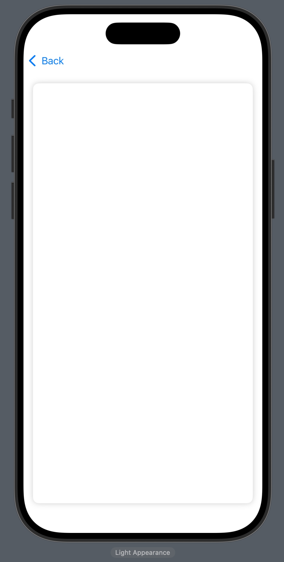
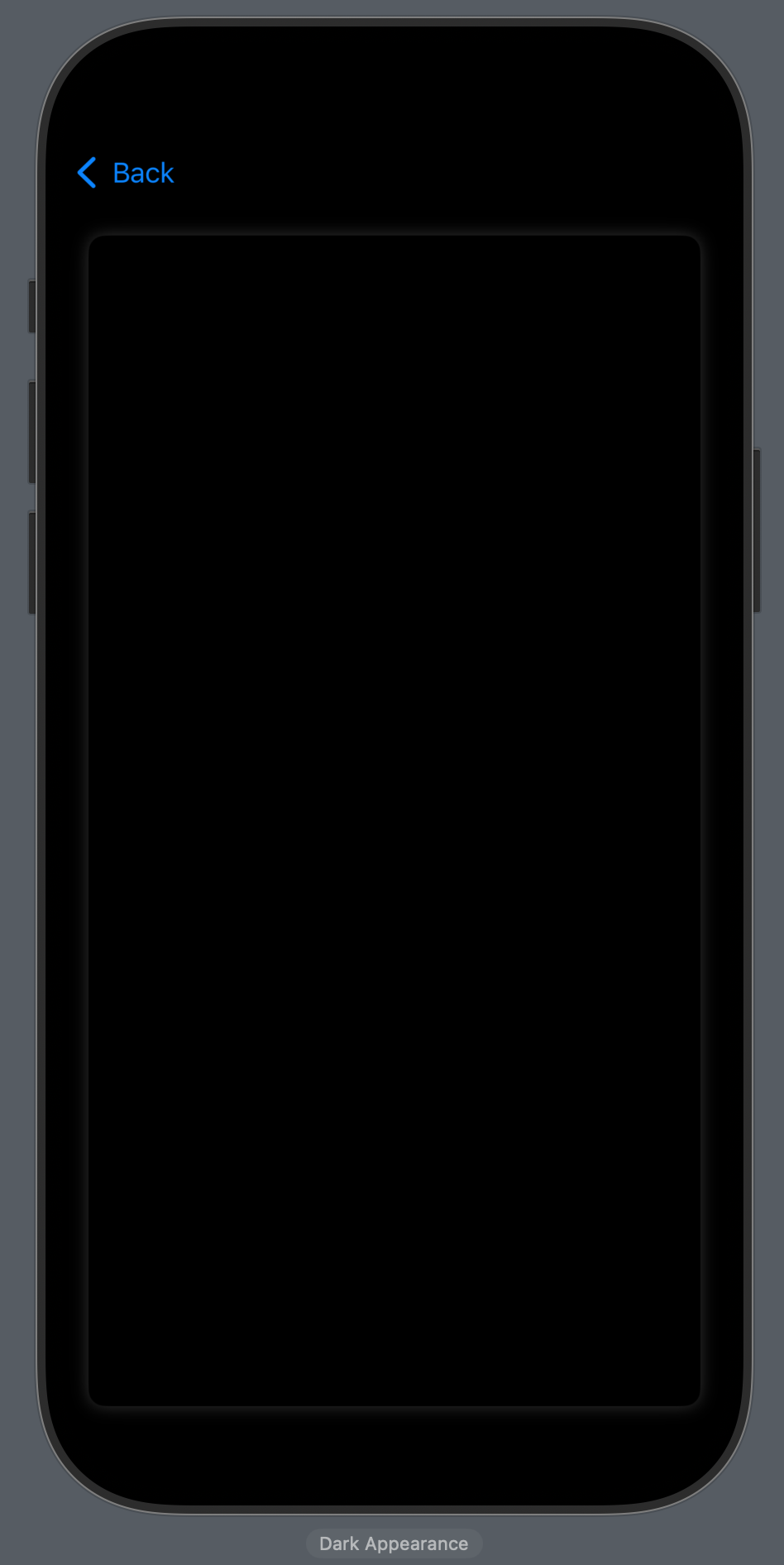
Yes, SwiftUI has Color.primary, but sometimes you need custom colors that actually look good in both light and dark mode.
Bridging: UIKit’s Dynamic Colors
UIKit has some magic here:
let adaptiveColor = UIColor { traitCollection in
    return traitCollection.userInterfaceStyle == .dark ? .black : .white
}
With SwiftUI:
Color(adaptiveColor)
Let’s get into transitions.
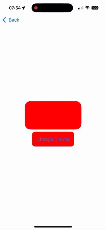
Fade to (Not) Black: Color Transitions
Hard cuts between themes are the musical equivalent of skipping a drum fill — it just feels wrong. Instead, we need to blend colors smoothly like a perfectly executed transition from Battery to Damage, Inc..
Here’s how we interpolate colors dynamically:
struct ColorTransitionView: View {
    @State private var progress: CGFloat = 0.0

    var interpolatedColor: Color {
        Color(
            red: Double(1.0 - progress),
            green: 0.0,
            blue: Double(progress)
        )
    }

    var body: some View {
        VStack {
            RoundedRectangle(cornerRadius: 20)
                .fill(interpolatedColor)
                .frame(width: 200, height: 100)
                .animation(.easeInOut(duration: 1), value: progress)

            Button("Change Theme") {
                withAnimation {
                    progress = progress == 1.0 ? 0.0 : 1.0
                }
            }
            .padding()
            .background(interpolatedColor)
            .cornerRadius(10)
        }
    }
}
This smoothly transitions between colors as you toggle the theme. Great for branding shifts, dark/light mode animations, and general eye candy.
Enter The Theme Manager
Alright, let’s get serious. If you’re not managing your app’s theme with a central class, you’re doing it wrong — like playing One with a broken snare drum.
🔥 Meet ThemeManager:
fnial class ThemeManager: ObservableObject {
    @Published var primaryColor: Color = .black
    @Published var secondaryColor: Color = .yellow
}
Now every view can grab these Metallica-approved colors.
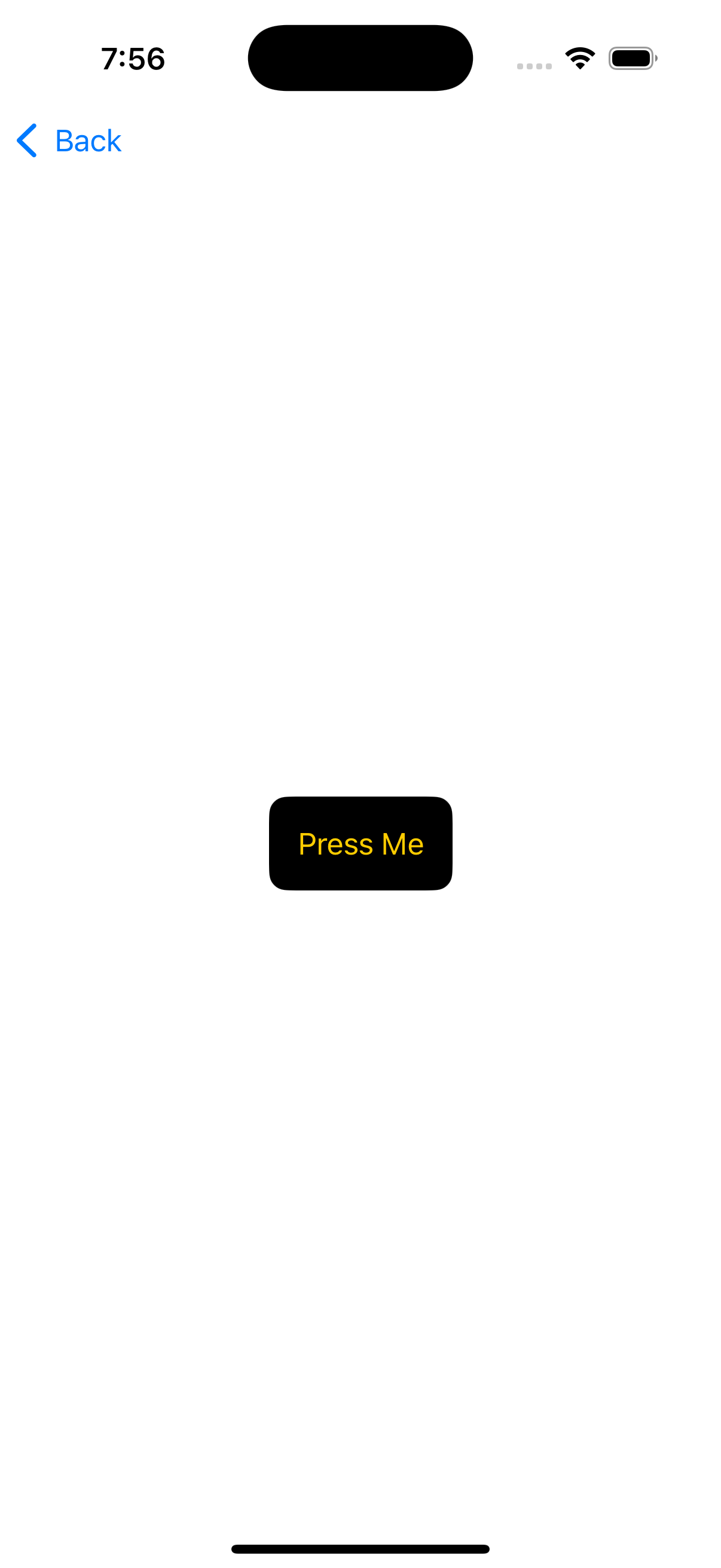
struct ThemedButton: View {
    @EnvironmentObject var theme: ThemeManager

    var body: some View {
        Button("Press Me") {}
            .padding()
            .background(theme.primaryColor)
            .foregroundStyle(theme.secondaryColor)
            .cornerRadius(10)
    }
}
Inject ThemeManager into your app’s root view:
struct MainColorView: View {
    var theme = ThemeManager()

    var body: some View {
        NavigationView {
            List {
                NavigationLink("Themed View", destination: ThemedView())
                NavigationLink("Color Transition View", destination: ColorTransitionView())
                NavigationLink("Themed Button View", destination: ThemedButton().environmentObject(theme))
            }
        }
        .navigationTitle("Metal Themed Views")
    }
}
Master of Themes: Bringing It All Together
Now that we’ve got an adaptive theme, smooth transitions, and dynamic UI updates, your app is no longer a garage band — it’s headlining a stadium tour.
Here’s your full SwiftUI-powered Metallica-themed app setup:
@main
struct MyApp: App {
    var theme = ThemeManager()

    var body: some Scene {
        WindowGroup {
            MainColorView()
                .environmentObject(theme)
        }
    }
}
🚀 What You Just Built:
- A dark/light mode aware UI that actually looks good.
- Color transitions that don’t feel like a jump cut in a bad music video.
- A global theme manager, so your app’s colors stay consistent.
Now go forth and make your SwiftUI UI as legendary as Metallica’s discography.
If you’re hungry for more tips, tricks, and a few battle-tested stories from the trenches of native mobile development, swing by my collection of articles: https://medium.com/@wesleymatlock.
These posts are packed with real-world solutions, some laughs, and the kind of knowledge that’s saved me from a few late-night debugging sessions. Let’s keep building apps that rock — and if you’ve got questions or stories of your own, drop me a line. I’d love to hear from you.
By Wesley Matlock on February 7, 2025.
Exported from Medium on May 10, 2025.