If you’ve ever built a SwiftUI app that deals with live data — heart rate tracking, step counts, workout intensity — you know the pain…
Real-Time Graphs & Charts in SwiftUI: Master of Data Visualization

If you’ve ever built a SwiftUI app that deals with live data — heart rate tracking, step counts, workout intensity — you know the pain. Charts that update once per second feel sluggish, animations can be janky, and don’t even get me started on CPU overhead when you try to brute-force the refresh rate.
So, what’s the fix? Swift Charts.
Apple’s Swift Charts framework makes real-time visualization smooth, but there’s a right way and a wrong way to do it. We’ll get into the hardcore stuff — how to make it buttery smooth, how to keep memory usage in check, and how to avoid dropping frames like Lars Ulrich drops drumsticks when someone mentions Napster.
Step 1: Creating a Working Real-Time Chart Demo
Step 1.1: Define the Data Model
Before we can shred through the UI, we need the data. Our HeartRateEntry model structures the information for heart rate tracking.
import Foundation
import SwiftUI
import Charts

struct HeartRateEntry: Identifiable, Equatable {
    let id = UUID()
    let timestamp: Date
    let bpm: Int
    let label: String // Identifies different data sources for multi-series charts

    static func random(label: String) -> HeartRateEntry {
        HeartRateEntry(timestamp: Date(), bpm: Int.random(in: 60...160), label: label)
    }
}
This model is the fuel — feeding the engine that is Swift Charts. If data were a riff, this struct would be the opening of Battery — fast, brutal, and relentless.
Step 1.2: Create the ViewModel
Our HeartRateViewModel serves as the engine that keeps the heart rate data flowing in real time. It ensures that new data is continuously added while maintaining a fixed buffer size to prevent performance issues.
import SwiftUI

final class HeartRateViewModel: ObservableObject {
    @Published var heartRateData: [HeartRateEntry] = []
    private var timer: Timer?
    private let maxDataPoints = 50

    init() {
        startUpdating()
    }

    func startUpdating() {
        timer = Timer.scheduledTimer(withTimeInterval: 0.1, repeats: true) { [weak self] _ in
            guard let self = self else { return }
            let newEntry = HeartRateEntry.random(label: "Heart Rate")
            DispatchQueue.main.async {
                self.heartRateData.append(newEntry)
                if self.heartRateData.count > self.maxDataPoints {
                    self.heartRateData.removeFirst()
                }
            }
        }
    }

    func stopUpdating() {
        timer?.invalidate()
        timer = nil
    }
}
- Manages Data Updates: The
startUpdating()method fires a timer that appends new heart rate entries every 0.1 seconds. - Prevents Memory Overload: The dataset is capped at
maxDataPoints, ensuring old data is removed as new data flows in. - Runs on Main Thread: Uses
DispatchQueue.main.asyncto prevent UI-related performance hiccups. - Cleanup: The
stopUpdating()method ensures that the timer is properly invalidated when the view disappears. —feeding the engine that is Swift Charts. If data were a riff, this struct would be the opening of Battery—fast, brutal, and relentless.
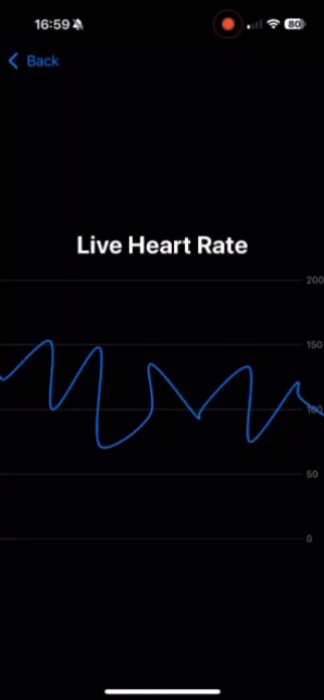
Step 1.2: Create the SwiftUI View
Now that we’ve got our data model, let’s throw it into the amplifier and make some noise.
import SwiftUI
import Charts

struct LiveHeartRateChart: View {
    @StateObject private var viewModel = HeartRateViewModel()

    var body: some View {
        VStack {
            Text("Live Heart Rate")
                .font(.title)
                .bold()
                .padding()

            Chart(viewModel.heartRateData) { entry in
                LineMark(
                    x: .value("Time", entry.timestamp),
                    y: .value("BPM", entry.bpm)
                )
                .interpolationMethod(.catmullRom)
            }
            .chartXAxis(.hidden)
            .frame(height: 300)
            .animation(.easeInOut(duration: 0.2), value: viewModel.heartRateData)
        }
        .onAppear {
            viewModel.startUpdating()
        }
        .onDisappear {
            viewModel.stopUpdating()
        }
    }
}


#Preview {
    LiveHeartRateChart()
}
This view is fast, fluid, and electrifying — just like Ride the Lightning. Watch as the data rips across the screen like a Kirk Hammett solo.
Step 2: Different Types of Charts You Can Use
Swift Charts supports multiple types of visualizations depending on the nature of your data. Below are different implementations as SwiftUI views with sample multi-series data. Think of these as the different albums in your Metallica discography — each with its own distinct sound.
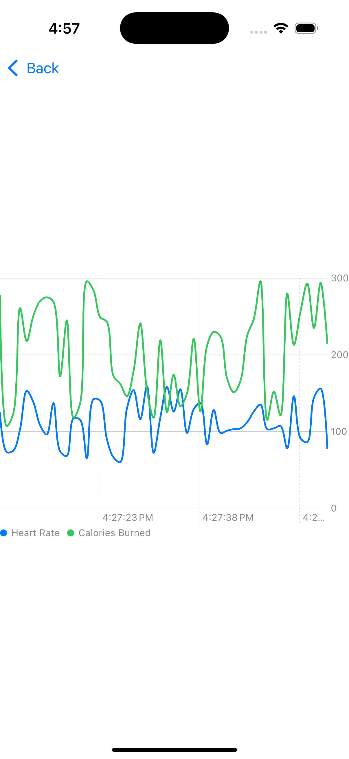
Line Chart (Ride the Lightning)
- Use Case: Ideal for showing trends over time, such as real-time heart rate monitoring, stock prices, or step counts.
- Why It Rocks: The line chart gives a clear, continuous flow of data, making it perfect for tracking how a metric changes over time.
- Enhancements: This example includes multiple series (heart rate vs. calories burned), letting users compare trends easily.
struct LineChartView: View {
    let data = [
        (1...50).map { HeartRateEntry(timestamp: Date().addingTimeInterval(Double($0) * -1.0), bpm: Int.random(in: 60...160), label: "Heart Rate") },
        (1...50).map { HeartRateEntry(timestamp: Date().addingTimeInterval(Double($0) * -1.0), bpm: Int.random(in: 100...300), label: "Calories Burned") }
    ].flatMap { $0 }

    var body: some View {
        Chart(data) { entry in
            LineMark(
                x: .value("Time", entry.timestamp.timeIntervalSince1970),
                y: .value("BPM", entry.bpm)
            )
            .foregroundStyle(by: .value("Type", entry.label))
            .interpolationMethod(.catmullRom)
        }
        .frame(height: 300)
    }
}
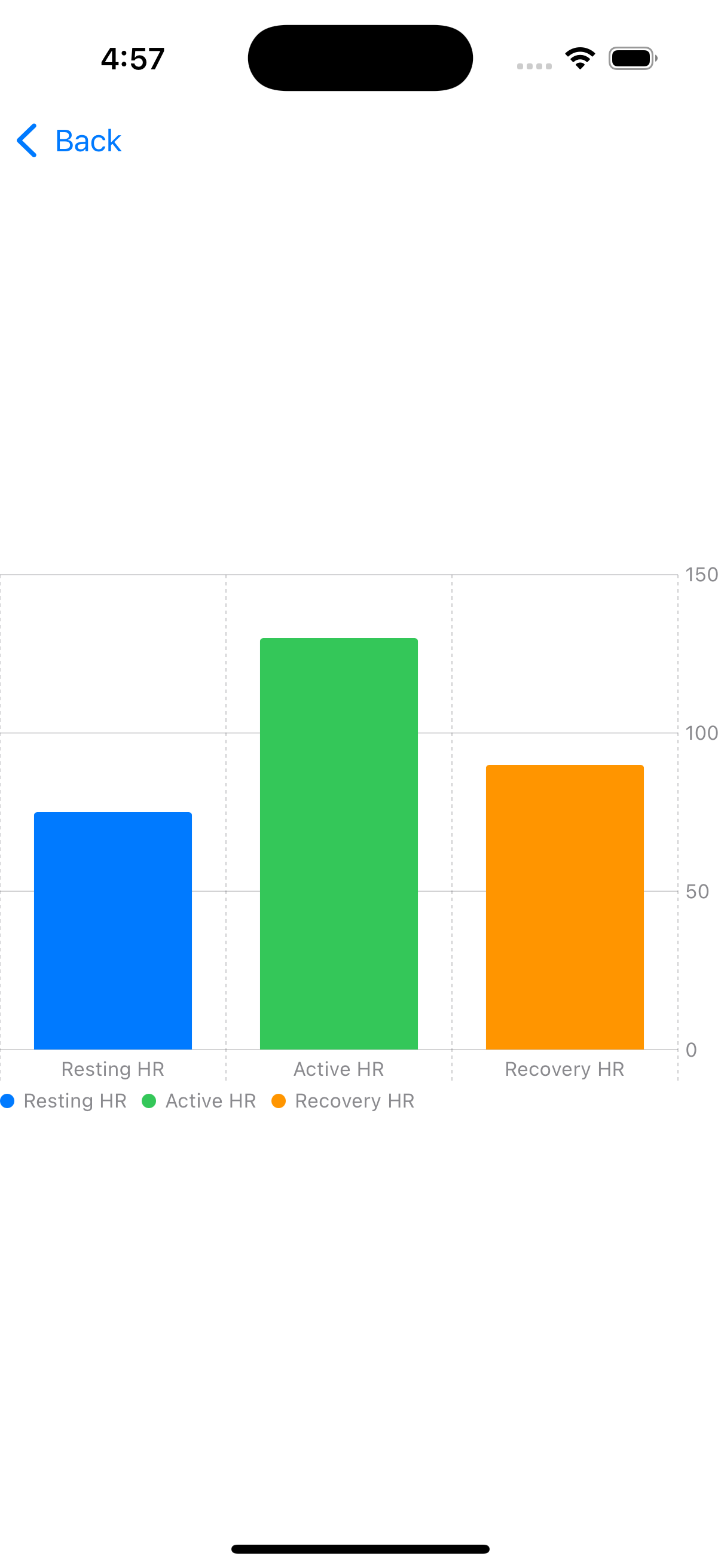
Bar Chart (Master of Puppets)
- Use Case: Best for comparing distinct categories, such as different heart rate zones or calorie burns per activity.
- Why It Rocks: The bar chart makes comparisons easy, great for quickly spotting high and low values.
- Enhancements: Uses color-coded categories for clarity.
struct BarChartView: View {
    let data = [
        HeartRateEntry(timestamp: Date(), bpm: 75, label: "Resting HR"),
        HeartRateEntry(timestamp: Date(), bpm: 130, label: "Active HR"),
        HeartRateEntry(timestamp: Date(), bpm: 90, label: "Recovery HR")
    ]

    var body: some View {
        Chart(data) { entry in
            BarMark(
                x: .value("Label", entry.label),
                y: .value("BPM", entry.bpm)
            )
            .foregroundStyle(by: .value("Type", entry.label))
        }
        .frame(height: 300)
    }
}
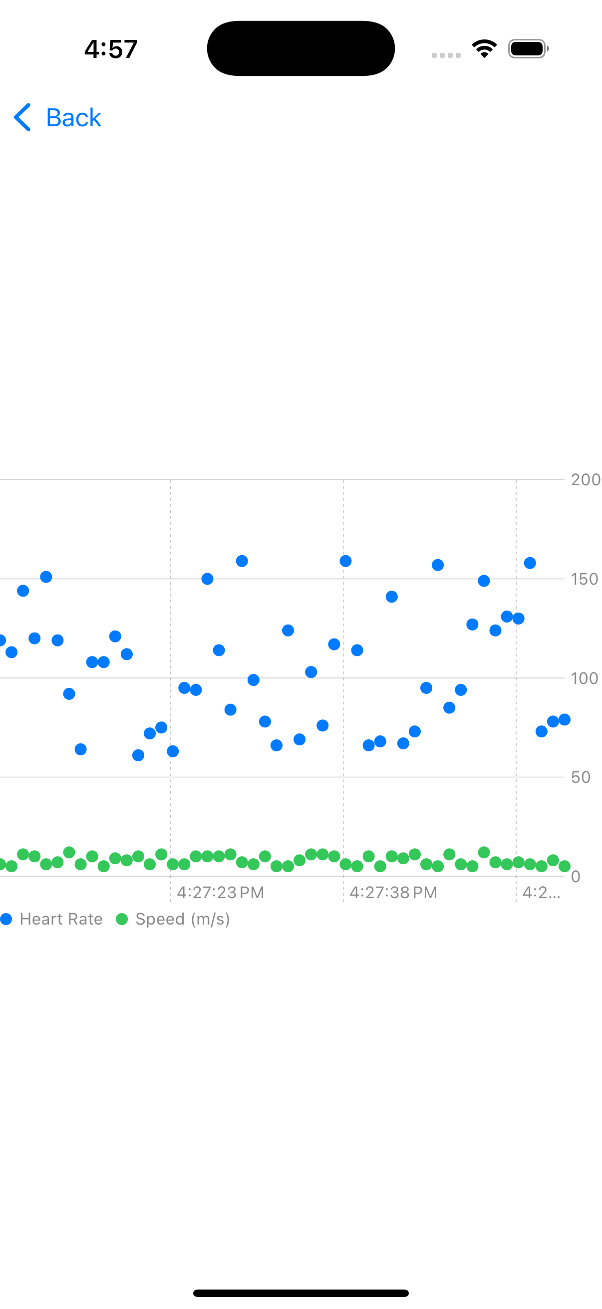
Scatter Chart (Kill ’Em All)
- Use Case: Great for showing relationships between different metrics, like heart rate vs. running speed.
- Why It Rocks: Scatter charts are great for spotting correlations and outliers.
- Enhancements: Uses two datasets to make relationships easy to see.
struct ScatterChartView: View {
    let data = [
        (1...50).map { HeartRateEntry(timestamp: Date().addingTimeInterval(Double($0) * -1.0), bpm: Int.random(in: 60...160), label: "Heart Rate") },
        (1...50).map { HeartRateEntry(timestamp: Date().addingTimeInterval(Double($0) * -1.0), bpm: Int.random(in: 5...12), label: "Speed (m/s)") }
    ].flatMap { $0 }

    var body: some View {
        Chart(data) { entry in
            PointMark(
                x: .value("Time", entry.timestamp),
                y: .value("BPM", entry.bpm)
            )
            .foregroundStyle(by: .value("Type", entry.label))
        }
        .frame(height: 300)
    }
}
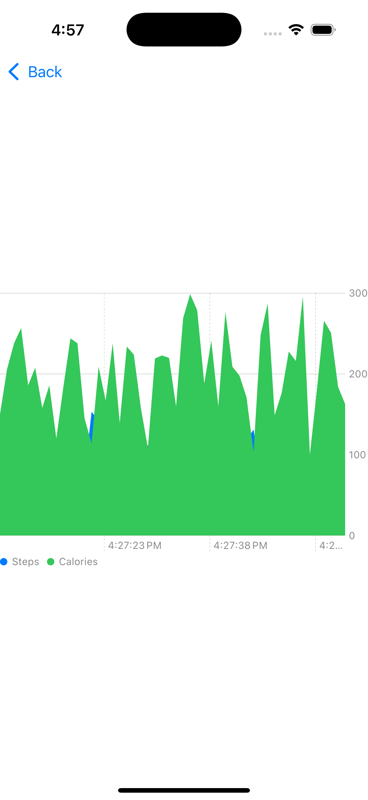
Area Chart (And Justice for All)
- Use Case: Best for cumulative data, such as total steps per hour or overall calories burned.
- Why It Rocks: The filled area creates a strong visual impact, making it easy to see the overall trend.
- Enhancements: Uses multiple layers to compare datasets, making it more informative.
struct AreaChartView: View {
    let data = [
        (1...50).map { HeartRateEntry(timestamp: Date().addingTimeInterval(Double($0) * -1.0), bpm: Int.random(in: 60...160), label: "Steps") },
        (1...50).map { HeartRateEntry(timestamp: Date().addingTimeInterval(Double($0) * -1.0), bpm: Int.random(in: 100...300), label: "Calories") }
    ].flatMap { $0 }

    var body: some View {
        Chart(data) { entry in
            AreaMark(
                x: .value("Time", entry.timestamp),
                y: .value("BPM", entry.bpm)
            )
            .foregroundStyle(by: .value("Type", entry.label))
        }
        .frame(height: 300)
    }
}
Wrap-up: Seek & Destroy Performance Bottlenecks
Now you’ve got a fully working real-time chart demo that’s optimized, animated, and smooth as Kirk Hammett’s solos. If you get an interview question on real-time data visualization, you now have battle-tested answers that will make you stand out.
Swift Charts is your weapon of choice — so wield it with confidence, crank up the performance, and shred through those UI bottlenecks like James Hetfield shreds through riffs.
If you’re hungry for more tips, tricks, and a few battle-tested stories from the trenches of native mobile development, swing by my collection of articles: https://medium.com/@wesleymatlock.
These posts are packed with real-world solutions, some laughs, and the kind of knowledge that’s saved me from a few late-night debugging sessions. Let’s keep building apps that rock — and if you’ve got questions or stories of your own, drop me a line. I’d love to hear from you.
🔥 Rock on, and happy charting! 🎸
By Wesley Matlock on February 19, 2025.
Exported from Medium on May 10, 2025.