SwiftUI’s TabView provides a powerful way to navigate through multiple views in your app with ease. Whether you’re building a simple app or…
Mastering SwiftUI’s TabView: Tips and Tricks for a Seamless User Experience
SwiftUI’s TabView provides a powerful way to navigate through multiple views in your app with ease. Whether you’re building a simple app or a complex application with multiple sections, TabView offers a straightforward and efficient way to handle tab-based navigation. In this blog post, we’ll dive deep into the technical details of TabView, explore advanced usage, and share tips and tricks to help you create a seamless user experience.
Introduction to TabView
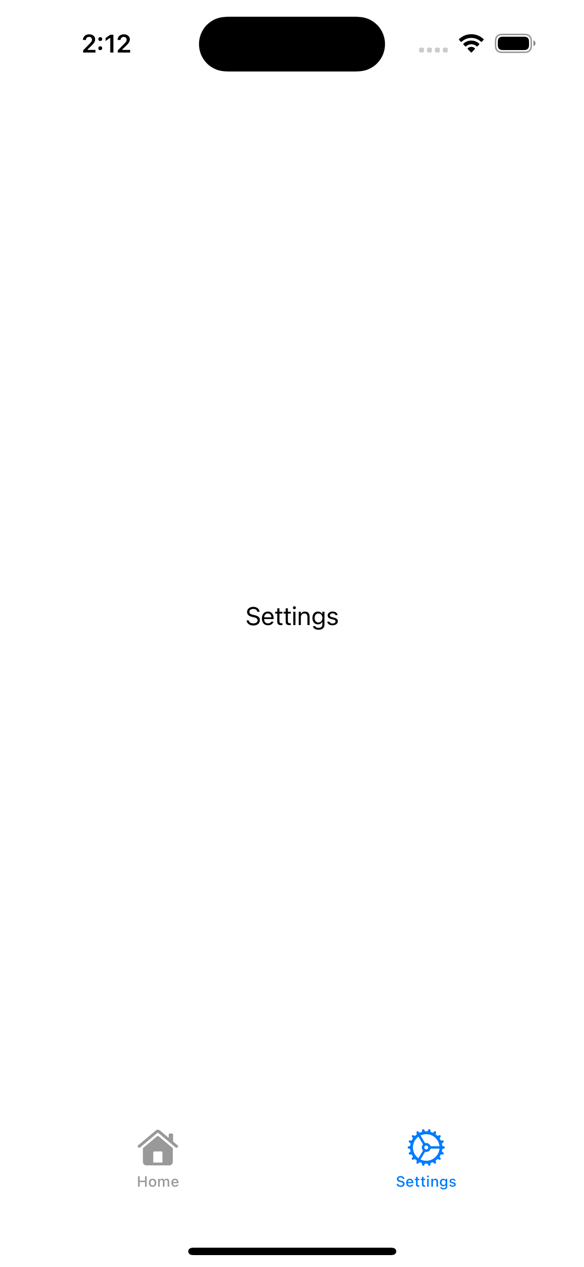
TabView in SwiftUI allows you to create a tab-based interface. Each tab corresponds to a different view, and users can switch between these views by tapping on the tabs. Here’s a basic example:
import SwiftUI

struct MainTabView: View {
  var body: some View {
    TabView {
      Text("Home")
        .tabItem {
          Image(systemName: "house")
          Text("Home")
        }
      Text("Settings")
        .tabItem {
          Image(systemName: "gear")
          Text("Settings")
        }
    }
  }
}

#Preview {
  MainTabView()
}
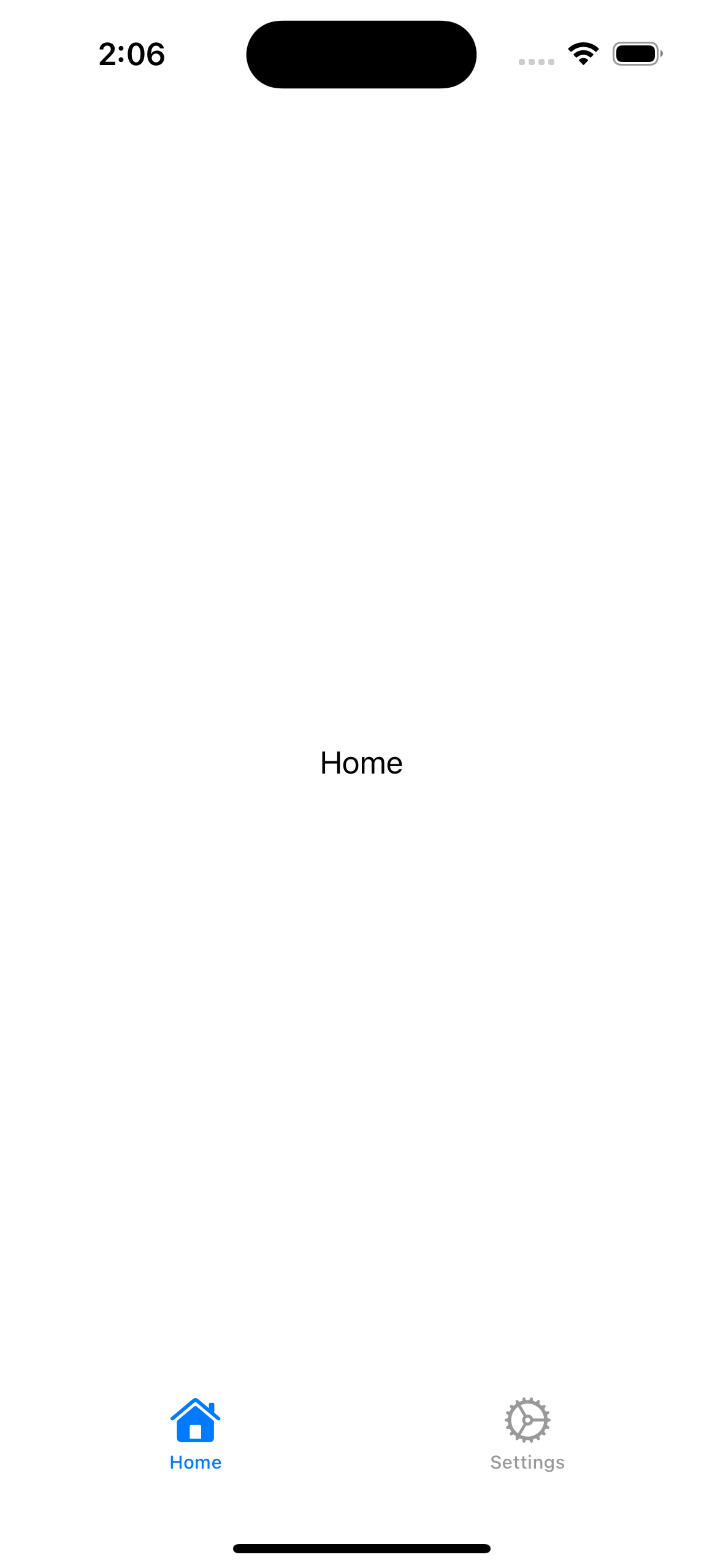
In this example, we have a TabView with two tabs: Home and Settings, each displaying a Text view.
Customizing TabView Appearance
1. Tab Bar Customization
You can customize the appearance of the tab bar to match your app’s design language. SwiftUI provides a range of modifiers to help you achieve this.
struct MainTabView: View {
  var body: some View {
    TabView {
      Text("Home")
        .tabItem {
          Image(systemName: "house.fill")
          Text("Home")
        }
     Text("Settings")
      .tabItem {
        Image(systemName: "gearshape.fill")
        Text("Settings")
        }
    }
  }
}
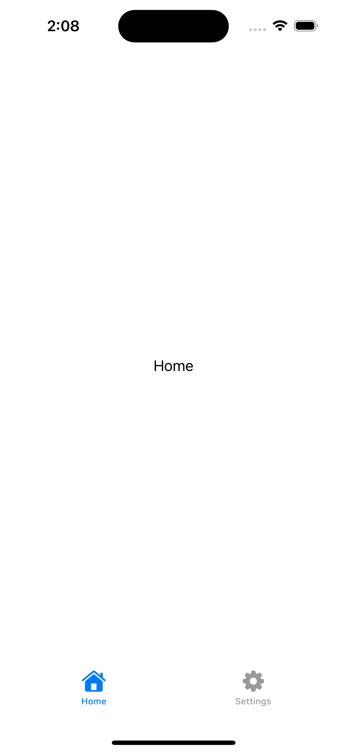
By using filled SF Symbols, you can create a more prominent icon style.
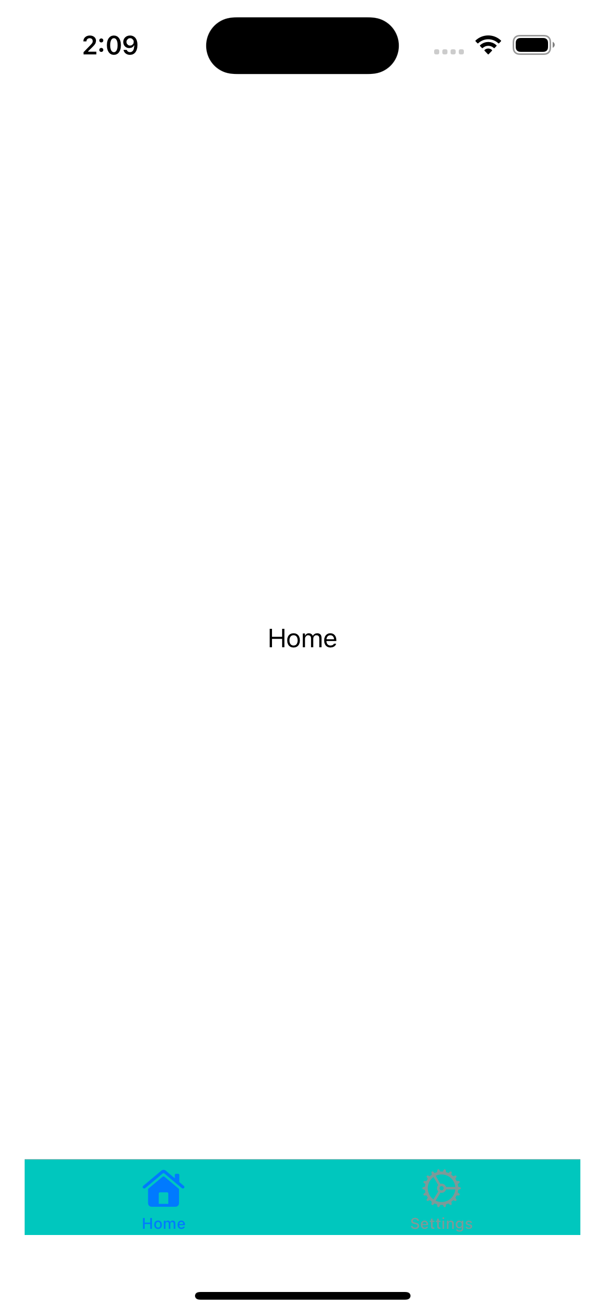
Changing Tab Bar Color
To change the tab bar’s background color and item colors, you can use the UITabBarAppearance API in combination with UIViewControllerRepresentable.
struct ColorTabView: View {
  init() {
    let appearance = UITabBarAppearance()
    appearance.configureWithOpaqueBackground()
    appearance.backgroundColor = .systemMint

    UITabBar.appearance().standardAppearance = appearance
    UITabBar.appearance().scrollEdgeAppearance = appearance
  }

  var body: some View {
    TabView {
      Text("Home")
        .tabItem {
          Image(systemName: "house")
          Text("Home")
        }
      Text("Settings")
        .tabItem {
          Image(systemName: "gear")
          Text("Settings")
        }
    }
  }
}
2. Programmatic Tab Selection
SwiftUI allows you to control the selected tab programmatically using a @State variable.
struct SelectableTabView: View {
  @State private var selectedTab = 0

  var body: some View {
    TabView(selection: $selectedTab) {
      Text("Home")
        .tabItem {
          Image(systemName: "house")
          Text("Home")
        }
        .tag(0)

      Text("Settings")
        .tabItem {
          Image(systemName: "gear")
          Text("Settings")
        }
        .tag(1)
    }
  }
}
You can change the selected tab by updating the selectedTab state.
3. Custom Tab Bar Items
For more advanced customization, you can create custom tab bar items by overlaying views on the TabView.
struct CustomTabView: View {
  @State private var selectedTab = 0

  var body: some View {
    ZStack {
      TabView(selection: $selectedTab) {
        Text("Home")
          .tabItem { EmptyView() }
          .tag(0)
        Text("Settings")
          .tabItem { EmptyView() }
          .tag(1)
      }

      VStack {
        Spacer()
        HStack {
          Spacer()
          CustomTabBarItem(image: "house", selected: $selectedTab, index: 0)
          Spacer()
          CustomTabBarItem(image: "gear", selected: $selectedTab, index: 1)
          Spacer()
        }
        .padding(.bottom, 10)
      }
    }
  }
}

struct CustomTabBarItem: View {
  let image: String
  @Binding var selected: Int
  let index: Int

  var body: some View {
    Button(action: {
      selected = index
    }) {
      Image(systemName: image)
        .foregroundColor(selected == index ? .blue : .gray)
        .padding()
        .background(selected == index ? Color.white : Color.clear)
        .cornerRadius(10)
    }
  }
}
This approach gives you full control over the tab bar’s appearance and behavior.
Advanced Usage
Handling State with EnvironmentObject
In SwiftUI, EnvironmentObject allows you to inject an observable object into the environment, making it accessible to any view within the view hierarchy that needs it. This is particularly useful in a TabView, where multiple tabs may need access to shared state.
1. Create an Observable Object
First, define an observable object that will hold the shared state. This object conforms to the ObservableObject protocol and uses the @Published property wrapper to notify views about state changes.
import SwiftUI
import Combine

class AppState: ObservableObject {
    @Published var isLoggedIn: Bool = false
    @Published var userName: String = ""
}
2. Inject the Observable Object into the Environment
In your main app struct, create an instance of AppState and inject it into the environment using the .environmentObject modifier.
@main
struct MyApp: App {
  @StateObject private var appState = AppState()

  var body: some Scene {
    WindowGroup {
      ContentView()
        .environmentObject(appState)
    }
  }
}
3. Access the Environment Object in Your Views
In your TabView, and any view that needs access to the shared state, use the @EnvironmentObject property wrapper to access the AppState instance.
struct AdvancedTabView: View {
var body: some View {
TabView {
HomeView()
.tabItem {
Image(systemName: "house")
Text("Home")
}
SettingsView()
.tabItem {
Image(systemName: "gear")
Text("Settings")
}
}
}
}
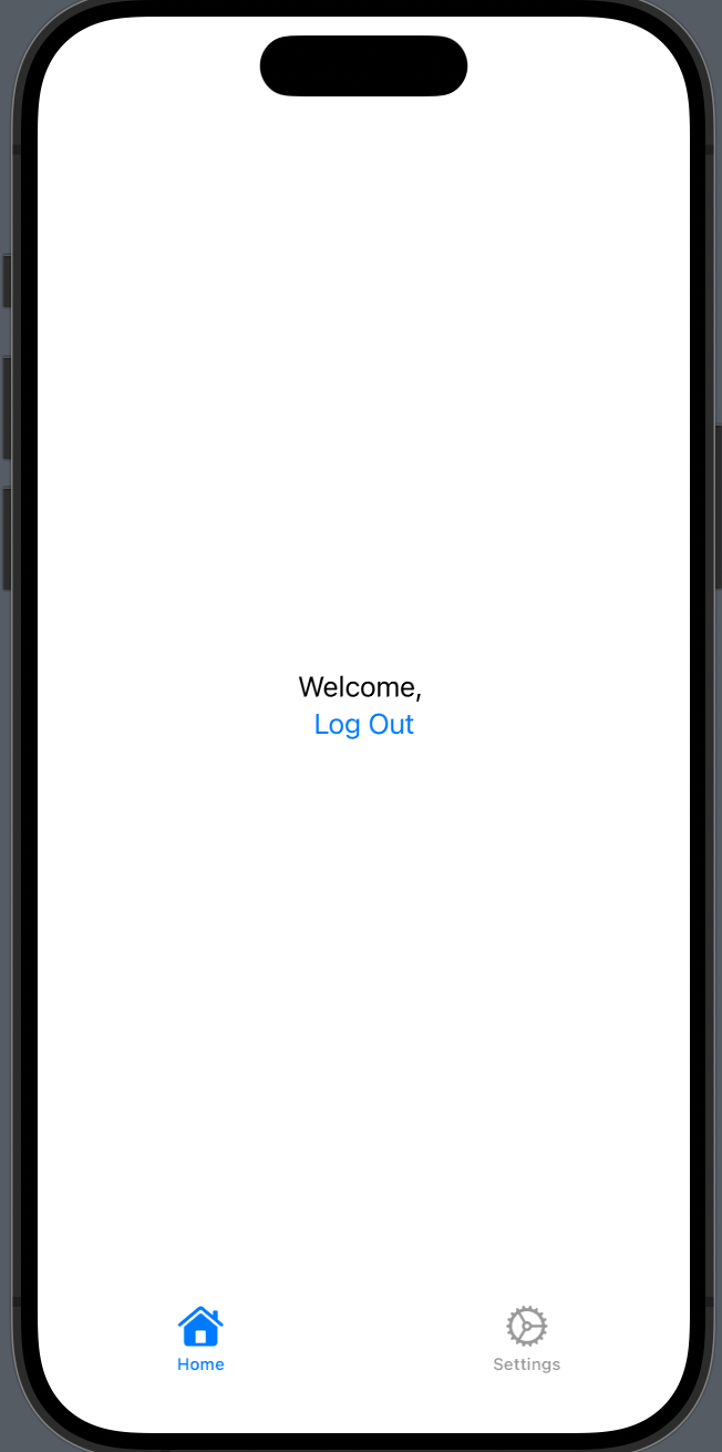
struct HomeView: View {
@EnvironmentObject var appState: AppState
var body: some View {
VStack {
Text("Welcome, \(appState.userName)")
Button("Log Out") {
appState.isLoggedIn = false
}
}
}
}
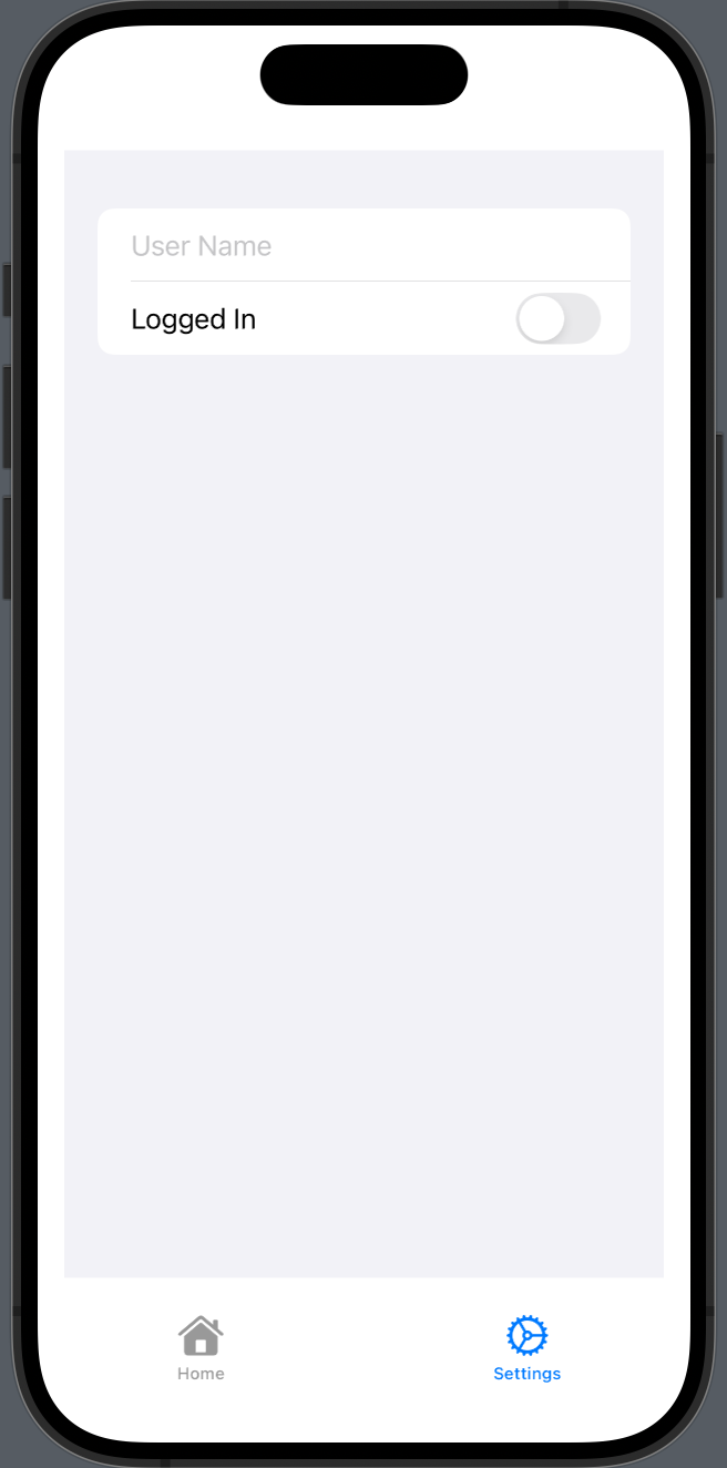
struct SettingsView: View {
@EnvironmentObject var appState: AppState
var body: some View {
Form {
TextField("User Name", text: $appState.userName)
Toggle("Logged In", isOn: $appState.isLoggedIn)
}
.padding()
}
}
In this example:
• AppState Class: Holds the shared state with isLoggedIn and userName properties.
• MyApp Struct: Creates and injects AppState into the environment.
• ContentView Struct: Contains the TabView with HomeView and SettingsView.
• HomeView and SettingsView Structs: Access and modify the shared state using @EnvironmentObject.
Benefits of Using EnvironmentObject
• Global State Management: Easily share and manage state across multiple views and tabs without passing state down the view hierarchy.
• Reactive Updates: Automatically update views when the state changes, thanks to the @Published property wrapper.
• Simplified Code: Reduce boilerplate code and improve the readability of your state management logic.
Advanced Tips
1. Combining with @ObservedObject and @StateObject
For more granular state management, combine @EnvironmentObject with @ObservedObject and @StateObject in individual views.
struct ProfileView: View {
  @StateObject private var profileViewModel = ProfileViewModel()

  var body: some View {
    VStack {
      Text("Profile")
      // Use profileViewModel for local state management
    }
    .environmentObject(profileViewModel)
  }
}

class ProfileViewModel: ObservableObject {
  @Published var profile: Profile = Profile()
}
2. Testing EnvironmentObject
When writing unit tests, you can easily provide a mock environment object to test individual views in isolation.
#Preview {
  AdvancedTabView()
    .environmentObject(AppState())
}
Conclusion
SwiftUI’s TabView is a versatile and powerful component for creating tab-based interfaces. By leveraging the tips and tricks shared in this blog post, you can customize the appearance, manage state effectively, and add engaging animations to your TabView. Whether you’re building a simple or complex application, these techniques will help you deliver a seamless user experience.
If you want to learn more about native mobile development, you can check out the other articles I have written here: https://medium.com/@wesleymatlock
🚀 Happy coding! 🚀
By Wesley Matlock on August 12, 2024.
Exported from Medium on May 10, 2025.