SwiftUI has made it incredibly easy to create progress indicators with ProgressView. With the latest enhancements, we have even more…
Mastering ProgressView in SwiftUI: Advanced Techniques, Tips, and Tricks

SwiftUI has made it incredibly easy to create progress indicators with ProgressView. With the latest enhancements, we have even more powerful tools at our disposal. In this post, we’ll explore advanced techniques for customizing and utilizing ProgressView, and share some tips and tricks to get the most out of it. We’ll also provide sample source code and unit tests to ensure your progress indicators are reliable and robust.
1. Introduction to ProgressView
ProgressView is a versatile component that can represent both determinate and indeterminate progress. By default, it provides a simple, straightforward UI, but with some customization, it can be a powerful addition to any app.
Here’s a basic example of ProgressView:
struct BasicProgressView: View {
    @State private var progress: Double = 0.5

    var body: some View {
        ProgressView(value: progress)
            .progressViewStyle(LinearProgressViewStyle())
            .padding()
    }
}

2. Customizing ProgressView
2.1. Custom Progress Indicators
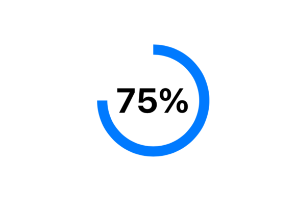
You can customize the look of ProgressView by creating your own ProgressViewStyle. Here’s an example of a custom circular progress view:
struct CustomCircularProgressViewStyle: ProgressViewStyle {
    func makeBody(configuration: Configuration) -> some View {
        ZStack {
            Circle()
                .trim(from: 0.0, to: CGFloat(configuration.fractionCompleted ?? 0))
                .stroke(Color.blue, lineWidth: 10)
                .rotationEffect(.degrees(-90))
                .animation(.linear, value: configuration.fractionCompleted)
            Text(String(format: "%.0f%%", (configuration.fractionCompleted ?? 0) * 100))
                .font(.largeTitle)
                .bold()
        }
    }
}

struct CustomProgressView: View {
    @State private var progress: Double = 0.75

    var body: some View {
        ProgressView(value: progress)
            .progressViewStyle(CustomCircularProgressViewStyle())
            .frame(width: 100, height: 100)
            .padding()
    }
}
2.2. Adding Animations
Animating progress changes can improve user experience. SwiftUI makes it simple to add smooth transitions and animations to ProgressView:
struct AnimatedProgressView: View {
    @State private var progress: Double = 0.0

    var body: some View {
        ProgressView(value: progress)
            .progressViewStyle(LinearProgressViewStyle())
            .padding()
            .onAppear {
                withAnimation(.easeInOut(duration: 2.0)) {
                    progress = 1.0
                }
            }
    }
}

3. Advanced Techniques
3.1. Binding Progress to Async Tasks
Progress can be tied to asynchronous tasks using Combine or Swift Concurrency. Here’s an example using Swift Concurrency:
import SwiftUI

struct AsyncTaskProgressView: View {
    @State private var progress: Double = 0.0

    var body: some View {
        VStack {
            ProgressView(value: progress)
                .progressViewStyle(LinearProgressViewStyle())
                .padding()

            Button("Start Task") {
                Task {
                    await startAsyncTask()
                }
            }
        }
    }

    func startAsyncTask() async {
        for i in 0...10 {
            try? await Task.sleep(nanoseconds: 500_000_000) // Sleep for 0.5 seconds
            progress = Double(i) / 10.0
        }
    }
}

4. Tips and Tricks
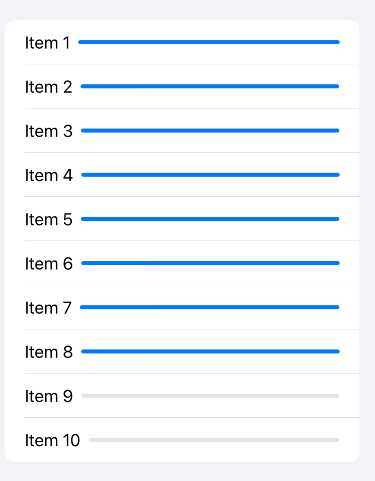
4.1. Using ProgressView in Lists
When using ProgressView in a List, ensure that state updates are efficient to prevent performance issues:
struct ListProgressView: View {
    @State private var items = Array(repeating: 0.0, count: 10)

    var body: some View {
        List(0..<items.count) { index in
            HStack {
                Text("Item \(index + 1)")
                ProgressView(value: items[index])
                    .progressViewStyle(LinearProgressViewStyle())
            }
        }
        .onAppear {
            for i in items.indices {
                DispatchQueue.main.asyncAfter(deadline: .now() + Double(i) * 0.5) {
                    items[i] = 1.0
                }
            }
        }
    }
}
4.2. Accessibility
Ensure your ProgressView is accessible by providing descriptive labels:
struct AccessibleProgressView: View {
    @State private var progress: Double = 0.5

    var body: some View {
        ProgressView("Loading...", value: progress)
            .progressViewStyle(CircularProgressViewStyle())
            .accessibilityLabel(Text("Loading progress"))
            .accessibilityValue(Text("\(Int(progress * 100)) percent completed"))
            .padding()
    }
}

5. Unit Tests
Testing ProgressView involves ensuring the progress updates correctly. Here’s an example of a unit test:
import XCTest
import SwiftUI
@testable import YourApp

class ProgressViewTests: XCTestCase {
    func testProgressView() {
        let progress = Binding<Double>(wrappedValue: 0.5)
        let progressView = ProgressView(value: progress.wrappedValue)

        XCTAssertEqual(progressView.value, 0.5)

        progress.wrappedValue = 1.0
        XCTAssertEqual(progressView.value, 1.0)
    }
}
Conclusion
With these advanced techniques and tips, you can leverage the full power of ProgressView in SwiftUI. Whether customizing the appearance, binding to async tasks, or ensuring accessibility, these enhancements will help you create more dynamic and responsive progress indicators in your apps.
Feel free to explore and adapt the provided examples to suit your needs.
I hope this post provides a comprehensive guide to mastering ProgressView in SwiftUI. Let me know if there are any other details you’d like to include!
If you want to learn more about native mobile development, you can check out the other articles I have written here: https://medium.com/@wesleymatlock
🚀 Happy coding! 🚀
By Wesley Matlock on July 9, 2024.
Exported from Medium on May 10, 2025.