SwiftUI provides a powerful and flexible way to manage layout and positioning through anchor preferences. This blog post will delve into…
Mastering Anchor Preferences in SwiftUI: Advanced Coordinate Space and Positioning
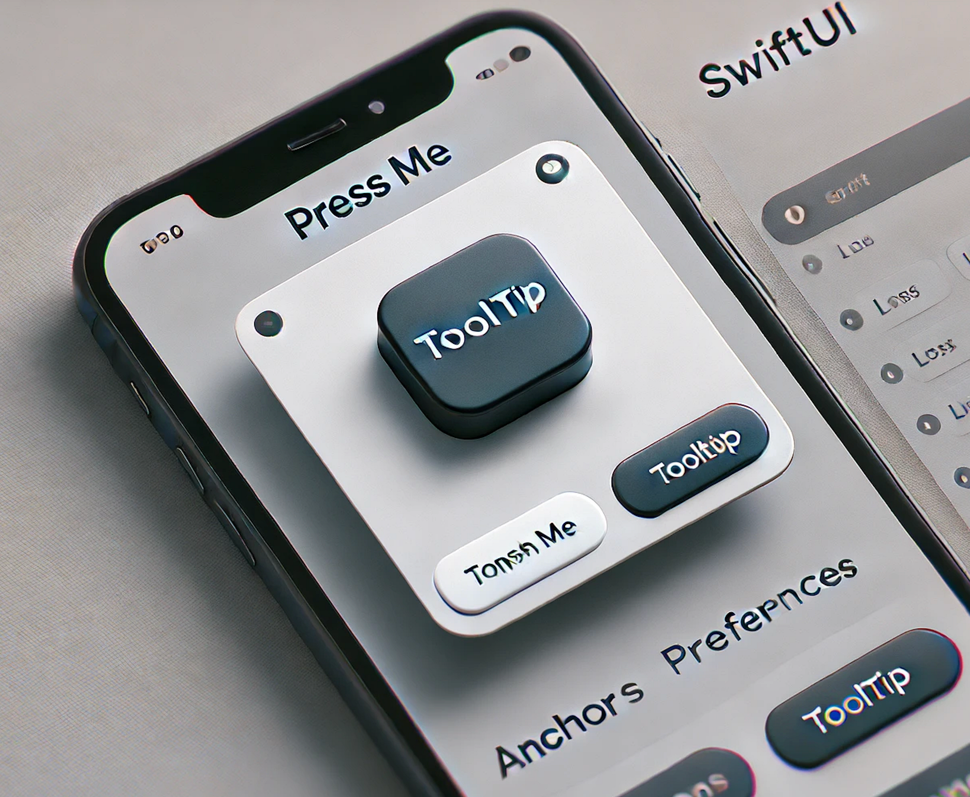
SwiftUI provides a powerful and flexible way to manage layout and positioning through anchor preferences. This blog post will delve into how to use anchor preferences for advanced coordinate space and positioning, with a practical example of implementing custom tooltips or popovers that follow UI elements.
What are Anchor Preferences?
Anchor preferences allow you to capture the geometry of a view and use it to drive the layout of other views. This is particularly useful for creating overlays, popovers, or tooltips that need to be positioned relative to other UI elements.
Using Anchor Preferences for Advanced Coordinate Space and Positioning
To use anchor preferences, you need to follow these steps:
-
Define an Anchor Preference Key: This key will store the geometry data.
-
Attach the Preference Key to a View: Use the .anchorPreference() modifier.
-
Read the Preference Key: Use the .overlayPreferenceValue() modifier to read and use the geometry data.
Implementing Custom Tooltips with Anchor Preferences
Let’s implement a custom tooltip that follows a button. The tooltip will appear when the button is pressed and disappear when released.
Step 1: Define an Anchor Preference Key
struct TooltipAnchorKey: PreferenceKey {
  typealias Value = Anchor<CGRect>?
  static var defaultValue: Anchor<CGRect>? = nil

  static func reduce(value: inout Anchor<CGRect>?, nextValue: () -> Anchor<CGRect>?) {
    value = nextValue() ?? value
  }
}
Step 2: Attach the Preference Key to a View
struct ContentView: View {
  @State private var showTooltip = false

  var body: some View {
    VStack {
      Spacer()

      Button(action: {
        withAnimation {
          showTooltip.toggle()
        }
      }) {
        Text("Press Me")
          .padding()
          .background(Color.blue)
          .foregroundColor(.white)
          .cornerRadius(8)
      }
      .anchorPreference(key: TooltipAnchorKey.self, value: .bounds) { $0 }

      Spacer()
    }
    .overlayPreferenceValue(TooltipAnchorKey.self) { anchor in
      GeometryReader { proxy in
        if let anchor = anchor, showTooltip {
          TooltipView()
            .position(proxy[anchor].topCenter)
            .transition(.opacity)
        }
      }
    }
    .padding()
  }
}

extension CGRect {
  var topCenter: CGPoint {
    CGPoint(x: midX, y: minY - 15)
  }
}
Step 3: Create the Tooltip View
struct TooltipView: View {
  var body: some View {
    Text("Tooltip")
      .padding()
      .background(Color.gray)
      .foregroundColor(.white)
      .cornerRadius(8)
      .shadow(radius: 5)
  }
}
Adding Unit Tests
Let’s add unit tests to ensure the functionality works as expected.
TooltipVisibilityTests.swift
import XCTest
import SwiftUI
import ViewInspector
@testable import AnchorPreferencesExample

final class TooltipVisibilityTests: XCTestCase {

    func testTooltipVisibility() {
        let contentView = ContentView()
        let exp = contentView.inspection.inspect { view in
            XCTAssertFalse(view.find(ViewType.TooltipView.self).isPresent)
            view.find(button: "Press Me").tap()
            XCTAssertTrue(view.find(ViewType.TooltipView.self).isPresent)
        }
        ViewHosting.host(view: contentView)
        wait(for: [exp], timeout: 1.0)
    }
}
“ViewInspector is a library for unit testing SwiftUI views. It allows for traversing a view hierarchy at runtime providing direct access to the underlying View structs.” — (https://github.com/nalexn/ViewInspector)
To use ViewInspector, you need to add the following package to your project:
.package(url: "https://github.com/nalexn/ViewInspector", from: "0.9.6")
Conclusion
In this blog post, we’ve explored how to use anchor preferences for advanced coordinate space and positioning in SwiftUI. By following these steps, you can create custom tooltips or popovers that dynamically follow UI elements. This technique can be extended to various other use cases, enhancing the interactivity and responsiveness of your SwiftUI applications.
Feel free to experiment with the provided code and adapt it to your specific needs. SwiftUI’s anchor preferences offer a powerful way to manage complex layouts, making your apps more dynamic and user-friendly.
If you want to learn more about native mobile development, you can check out the other articles I have written here: https://medium.com/@wesleymatlock
Happy coding! 🚀
By Wesley Matlock on June 27, 2024.
Exported from Medium on May 10, 2025.