As developers, it’s our responsibility to ensure that our applications are accessible to everyone, including those with disabilities. One…
Enhancing Your SwiftUI App with Dynamic Type and Accessibility
As developers, it’s our responsibility to ensure that our applications are accessible to everyone, including those with disabilities. One way to achieve this in SwiftUI is by using Dynamic Type and Accessibility features. This blog post will cover the basics of Dynamic Type, how to implement it in your SwiftUI app, and how to ensure your app is accessible to all users. We will also include unit tests to validate our implementation.
What is Dynamic Type?
Dynamic Type is a feature in iOS that allows users to adjust the text size on their device. By supporting Dynamic Type, you ensure that your app’s text is readable for users with varying visual needs. When a user changes their preferred text size in the Settings app, your app’s text will automatically adjust accordingly.
Implementing Dynamic Type in SwiftUI
Dynamic Type is a critical feature for creating accessible applications, allowing users to adjust text size to their preference. SwiftUI simplifies the process of integrating Dynamic Type into your app. Let’s delve deeper into how you can leverage Dynamic Type to enhance user experience.
1. Using System Fonts
SwiftUI provides a set of system fonts that automatically adapt to the user’s preferred text size. These fonts are .largeTitle, .title, .headline, .subheadline, .body, .callout, .footnote, .caption, and .caption2. By using these system fonts, your text elements will respect the user’s settings.
import SwiftUI

struct ContentView: View {
  var body: some View {
    VStack(alignment: .leading, spacing: 10) {
      Text("Large Title")
        .font(.largeTitle)
      Text("Title")
        .font(.title)
      Text("Headline")
        .font(.headline)
      Text("Subheadline")
        .font(.subheadline)
      Text("Body")
        .font(.body)
      Text("Callout")
        .font(.callout)
      Text("Footnote")
        .font(.footnote)
      Text("Caption")
        .font(.caption)
      Text("Caption 2")
        .font(.caption2)
    }
    .padding()
  }
}

#Preview {
  ContentView()
    .environment(\.sizeCategory, .extraExtraLarge) // For previewing different text sizes

}
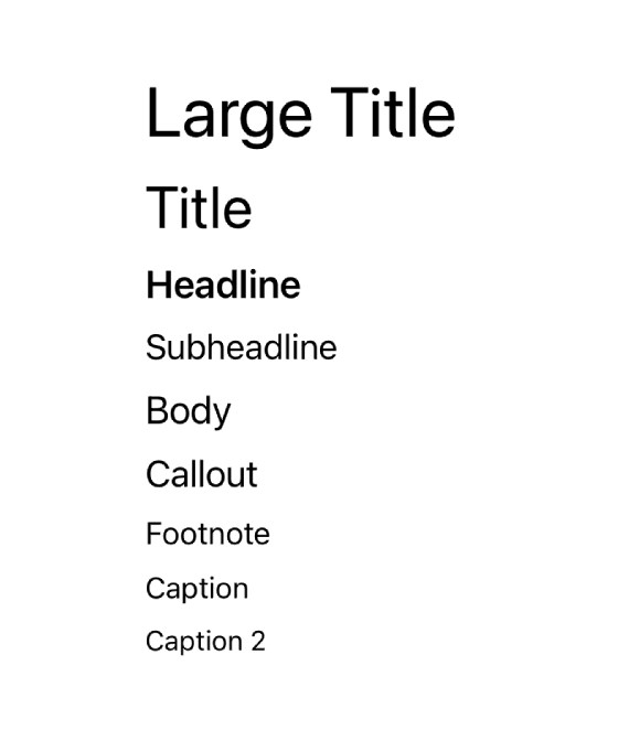
This code snippet demonstrates how to use various system fonts in SwiftUI. When the user adjusts the text size in the device settings, these text elements will automatically scale.
2. Custom Fonts with Dynamic Type
You can also use custom fonts while still supporting Dynamic Type. To achieve this, use the .scaledFont modifier in combination with UIFontMetrics.
struct CustomFontView: View {
  var body: some View {
    Text("Custom Font Example")
      .font(.custom("Futura-Medium", size: 20))
      .scaledToFill()
      .font(.title)
      .minimumScaleFactor(0.5)
      .padding()
  }
}

#Preview {
  CustomFontView()
    .environment(\.sizeCategory, .extraExtraLarge) // For previewing different text sizes
}
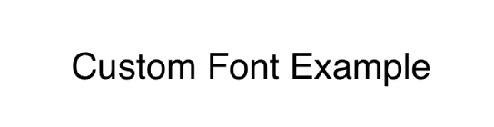
In this example, the custom font “Futura-Medium” is used and scaled according to the user’s preferred text size.
3. Adjusting Text Size for Accessibility
To ensure text size adjusts properly for accessibility, make sure to test your app with different text size settings. You can simulate different text sizes in Xcode Previews using the .environment(.sizeCategory, .extraExtraLarge) modifier.
#Preview {
  Group {
    CustomFontView()
      .previewDisplayName("Default Size")
    CustomFontView()
      .environment(\.sizeCategory, .extraSmall)
      .previewDisplayName("Extra Small Size")
    CustomFontView()
      .environment(\.sizeCategory, .extraExtraLarge)
      .previewDisplayName("Extra Extra Large Size")
    CustomFontView()
      .environment(\.sizeCategory, .accessibilityExtraExtraExtraLarge)
      .previewDisplayName("Accessibility 3XL Size")
  }
}
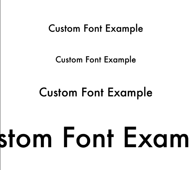
By using the Group view, you can create multiple previews with different text sizes, ensuring your app looks good in all scenarios.
4. Dynamic Type and Layout
Dynamic Type can affect your layout, especially if you have complex UI elements. Ensure that your layout adapts gracefully to different text sizes.
struct AdaptiveLayoutView: View {
  var body: some View {
    VStack {
      Text("This is a title")
        .font(.title)
        .padding()

      Text("This is a longer body text that demonstrates how text wrapping works when the font size increases. Make sure to test with different text sizes.")
        .font(.body)
        .padding()
    }
    .padding()
  }
}

#Preview {
  AdaptiveLayoutView()
    .environment(\.sizeCategory, .extraExtraLarge) // For previewing different text sizes
}
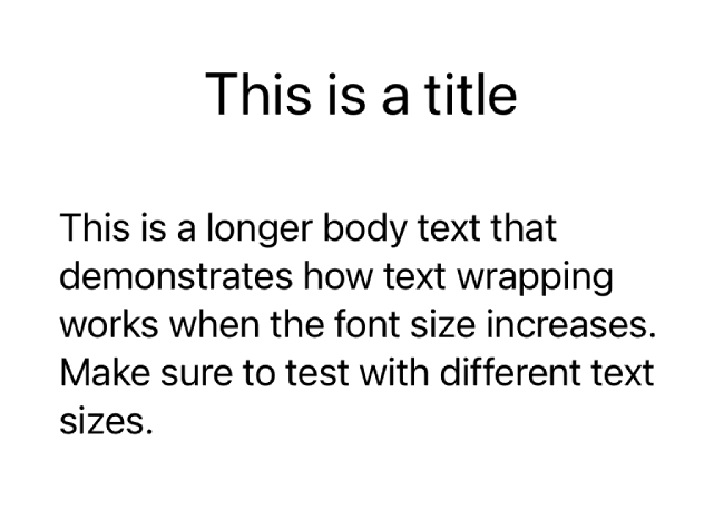
In this example, the VStack ensures that the text elements stack vertically, which helps in maintaining a readable layout when text size changes.
Ensuring Accessibility in SwiftUI
Making your SwiftUI app accessible ensures that all users, including those with disabilities, can use your app effectively. Accessibility features in iOS provide tools and guidelines to make apps inclusive. In this section, we’ll explore various techniques to enhance accessibility in SwiftUI, including using accessibility modifiers, testing with VoiceOver, and ensuring your app works well with other assistive technologies.
1. Using Accessibility Modifiers
SwiftUI provides several modifiers to enhance the accessibility of your views. Here are some key modifiers and how to use them:
-
accessibilityLabel: Provides a descriptive label for the element.
-
accessibilityHint: Provides additional information about the element’s action.
-
accessibilityValue: Provides the current value of the element.
-
accessibilityElement(children: .combine): Treats multiple child views as a single accessible element.
struct AccessibleView: View {
  var body: some View {
    VStack {
      Text("Welcome to our app!")
        .font(.title)
        .accessibilityLabel("Welcome message")
        .accessibilityHint("Displays a welcome message to the user.")
        .padding()

      Button(action: {
        // Action
      }) {
        Text("Continue")
          .font(.headline)
      }
      .accessibilityLabel("Continue button")
      .accessibilityHint("Tap to proceed to the next screen.")
      .padding()
    }
  }
}

#Preview {
  AccessibleView()
    .environment(\.sizeCategory, .extraExtraLarge) // For previewing different text sizes
}
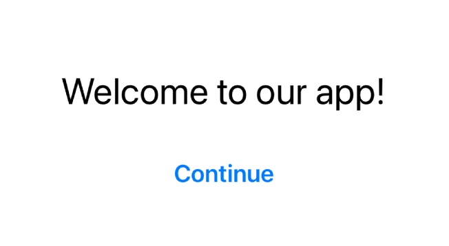
In this example, we added accessibilityLabel and accessibilityHint to both the Text and Button views, providing clear descriptions for VoiceOver users.
2. Grouping Views
Sometimes you may want to group multiple views into a single accessibility element. This can be achieved using the accessibilityElement(children: .combine) modifier.
struct GroupedView: View {
  var body: some View {
    HStack {
      Image(systemName: "star.fill")
      Text("Favorite")
    }
    .accessibilityElement(children: .combine)
    .accessibilityLabel("Favorite star")
    .accessibilityHint("Indicates this item is a favorite.")
  }
}

#Preview {
  GroupedView()
    .environment(\.sizeCategory, .extraExtraLarge) // For previewing different text sizes
}

Here, the Image and Text views are combined into a single accessible element, providing a clear and concise description.
3. Custom Accessibility Actions
You can define custom actions for accessible elements using the accessibilityAction modifier. This is useful for providing additional context or functionality.
struct CustomActionView: View {
  var body: some View {
    Button(action: {
      // Action
    }) {
      Text("Custom Action")
        .font(.headline)
    }
    .accessibilityAction(named: "Perform custom action") {
      // Perform custom action
    }
  }
}

#Preview {
  CustomActionView()
    .environment(\.sizeCategory, .extraExtraLarge) // For previewing different text sizes
}

In this example, a custom accessibility action named “Perform custom action” is added to the button.
4. Testing with VoiceOver
VoiceOver is a screen reader that provides spoken feedback to users. Testing your app with VoiceOver helps ensure that your app is accessible. You can enable VoiceOver in the Settings app under Accessibility.
While testing, navigate through your app using VoiceOver gestures and ensure that:
-
All interactive elements are reachable.
-
Accessibility labels, hints, and values provide clear information.
-
The navigation order is logical and intuitive.
-
Custom actions are properly described and functional.
5. Dynamic Type and VoiceOver
Ensure that your app supports both Dynamic Type and VoiceOver by testing how text resizing and spoken feedback work together. Use the .environment(.sizeCategory, .extraExtraLarge) modifier in your previews to simulate different text sizes.
6. Accessibility in Forms
Forms and interactive elements like text fields and sliders should be accessible. Use the accessibilityLabel, accessibilityHint, and accessibilityValue modifiers to provide necessary context.
struct AccessibleForm: View {
  @State private var name: String = ""

  var body: some View {
    Form {
      TextField("Name", text: $name)
        .accessibilityLabel("Name input field")
        .accessibilityHint("Enter your full name.")
        .accessibilityValue(name)
    }
  }
}

#Preview {
  AccessibleForm()
    .environment(\.sizeCategory, .extraExtraLarge) // For previewing different text sizes
}
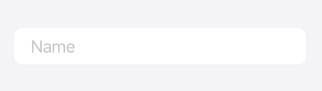
In this example, the TextField is enhanced with accessibility labels, hints, and values.
Conclusion
By using system fonts and custom fonts with Dynamic Type, you can ensure that your SwiftUI app’s text adapts to the user’s preferred size, making your app more readable and user-friendly. Testing with various text sizes in Xcode Previews helps catch and fix layout issues early, ensuring a seamless experience for all users. Supporting Dynamic Type not only enhances accessibility but also improves the overall user experience.
In addition, using accessibility modifiers, grouping views for better navigation, defining custom actions, and thoroughly testing with VoiceOver can make your SwiftUI app accessible to a wider audience. Ensuring accessibility is not just about meeting guidelines; it’s about creating an inclusive and enjoyable experience for everyone. By prioritizing accessibility, you make your app welcoming and usable for all users, regardless of their abilities.
If you want to learn more about native mobile development, you can check out the other articles I have written here: https://medium.com/@wesleymatlock
🚀 Happy coding! 🚀
By Wesley Matlock on July 31, 2024.
Exported from Medium on May 10, 2025.