Introduction
Elevate Your SwiftUI Apps: Mastering PlaceholderContentView for a Polished User Experience
Introduction
PlaceholderContentView is a specialized type in SwiftUI used internally by the framework. While you don’t directly interact with PlaceholderContentView in your code, understanding its role can enhance your comprehension of SwiftUI’s rendering and layout system. This blog post aims to elucidate the purpose and functionality of PlaceholderContentView within the context of SwiftUI development, and provide practical techniques to create engaging placeholder content.
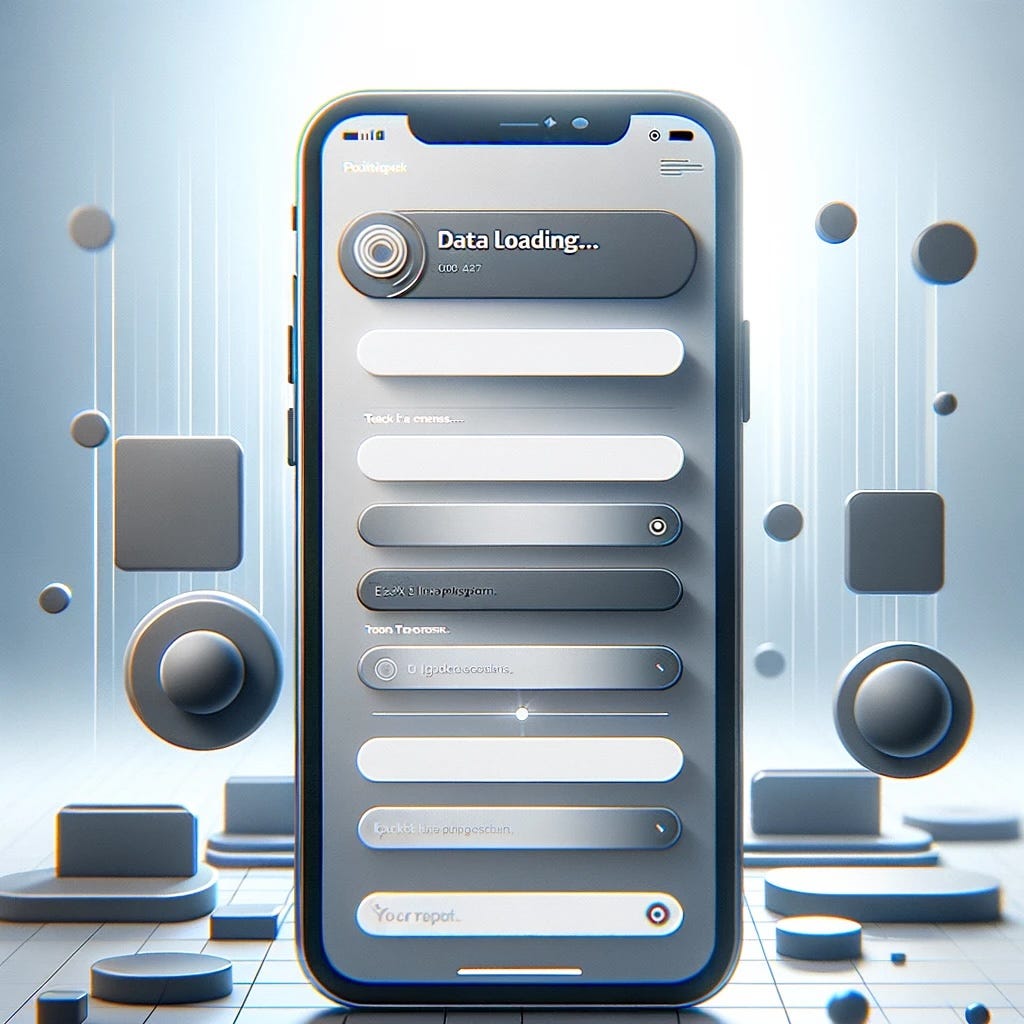
What is PlaceholderContentView?
PlaceholderContentView is a placeholder type used to construct inline modifiers, transitions, or other helper types in SwiftUI. The framework creates this type on your behalf, and you typically won’t need to instantiate or interact with it directly.
How SwiftUI Uses PlaceholderContentView
SwiftUI leverages PlaceholderContentView in various internal mechanisms to manage animations, transitions, and other modifications applied to views. Here are some key areas where PlaceholderContentView plays a role:
1. Inline Modifiers and Transitions:
• When you use transitions in SwiftUI, such as .transition(), the framework may internally utilize PlaceholderContentView to manage these changes. This helps ensure smooth animations when a view is added to or removed from the hierarchy.
2. Keyframe Animations:
• SwiftUI provides powerful animation capabilities through keyframe animators. Methods like keyframeAnimator(initialValue:repeating:content:keyframes:) and keyframeAnimator(initialValue:trigger:content:keyframes:) use PlaceholderContentView to define and manage the animated content. These functions loop keyframes continuously or play them based on a trigger, updating the view using the modifiers you apply within the body closure.
3. Phase Animations:
• The phaseAnimator methods animate effects applied to a view over a sequence of phases that change continuously or based on a trigger. Similar to keyframe animations, PlaceholderContentView helps manage these animations to ensure they are executed correctly within the view hierarchy.
Implementing PlaceholderContentView
Let’s dive into the code to see how you can implement effective placeholder content in your SwiftUI project.
Step 1: Define Your Placeholder Content
First, create a view that will serve as your placeholder content. This could be a skeleton loader, a static image, or any other visual element that represents the loading state.
struct MyPlaceholderView: View {
    var body: some View {
        VStack {
            ForEach(0..<3) { _ in
                HStack {
                    Circle()
                        .fill(Color.gray.opacity(0.3))
                        .frame(width: 50, height: 50)
                    VStack(alignment: .leading) {
                        Rectangle()
                            .fill(Color.gray.opacity(0.3))
                            .frame(height: 20)
                        Rectangle()
                            .fill(Color.gray.opacity(0.3))
                            .frame(height: 20)
                            .padding(.top, 5)
                    }
                    .padding(.leading, 10)
                }
                .padding()
            }
        }
    }
}
Step 2: Integrate Placeholder Content into Your Main View
Next, integrate the placeholder content into your main view. You can use a state variable to toggle between the placeholder and the actual content.
struct ContentView: View {
    @State private var isLoading = true

    var body: some View {
        Group {
            if isLoading {
                MyPlaceholderView()
            } else {
                // Your actual content view
                Text("Content Loaded")
            }
        }
        .onAppear {
            // Simulate a network load delay
            DispatchQueue.main.asyncAfter(deadline: .now() + 3) {
                isLoading = false
            }
        }
    }
}
Advanced Techniques for PlaceholderContentView
1. Adding Animations
Animations can make your placeholders more engaging. Here’s how you can add a pulsing animation to the placeholder elements:
struct AnimatedPlaceholderView: View {
    @State private var animate = false

    var body: some View {
        VStack {
            ForEach(0..<3) { _ in
                HStack {
                    Circle()
                        .fill(Color.gray.opacity(0.3))
                        .frame(width: 50, height: 50)
                        .scaleEffect(animate ? 1.1 : 1.0)
                    VStack(alignment: .leading) {
                        Rectangle()
                            .fill(Color.gray.opacity(0.3))
                            .frame(height: 20)
                            .scaleEffect(animate ? 1.1 : 1.0)
                        Rectangle()
                            .fill(Color.gray.opacity(0.3))
                            .frame(height: 20)
                            .padding(.top, 5)
                            .scaleEffect(animate ? 1.1 : 1.0)
                    }
                    .padding(.leading, 10)
                }
                .padding()
            }
        }
        .onAppear {
            withAnimation(Animation.easeInOut(duration: 1).repeatForever(autoreverses: true)) {
                animate.toggle()
            }
        }
    }
}
2. Using Shimmer Effects
Shimmer effects can provide a visually appealing way to indicate loading. Here’s an example of a shimmer effect using a custom modifier:
struct ShimmerView: View {
  @State private var shimmer = false

  var body: some View {
    VStack {
      ForEach(0..<3) { _ in
        HStack {
          Circle()
            .fill(Color.green.opacity(0.3))
            .frame(width: 50, height: 50)
            .modifier(ShimmerEffect())
          VStack(alignment: .leading) {
            Rectangle()
              .fill(Color.green.opacity(0.3))
              .frame(height: 20)
              .modifier(ShimmerEffect())
            Rectangle()
              .fill(Color.green.opacity(0.3))
              .frame(height: 20)
              .padding(.top, 5)
              .modifier(ShimmerEffect())
          }
          .padding(.leading, 10)
        }
        .padding()
      }
    }
  }
}

struct ShimmerEffect: ViewModifier {
  @State private var startPoint = UnitPoint(x: -1, y: 0.5)
  @State private var endPoint = UnitPoint(x: 1, y: 0.5)

  func body(content: Content) -> some View {
    content
      .overlay(
        LinearGradient(gradient: Gradient(colors: [Color.white.opacity(0.5), Color.white.opacity(0.1), Color.white.opacity(0.5)]), startPoint: startPoint, endPoint: endPoint)
          .blendMode(.overlay)
          .mask(content)
      )
      .onAppear {
        withAnimation(Animation.easeInOut(duration: 1.5).repeatForever(autoreverses: false)) {
          startPoint = UnitPoint(x: 1, y: 0.5)
          endPoint = UnitPoint(x: -1, y: 0.5)
        }
      }
  }
}
3. Customizing with Themes
Tailoring the placeholder content to match your app’s theme can make your placeholders look more integrated. This involves using your app’s color palette, fonts, and design language.
struct ThemedPlaceholderView: View {
    var body: some View {
        VStack {
            ForEach(0..<3) { _ in
                HStack {
                    Circle()
                        .fill(Color.blue.opacity(0.3))
                        .frame(width: 50, height: 50)
                    VStack(alignment: .leading) {
                        Rectangle()
                            .fill(Color.blue.opacity(0.3))
                            .frame(height: 20)
                        Rectangle()
                            .fill(Color.blue.opacity(0.3))
                            .frame(height: 20)
                            .padding(.top, 5)
                    }
                    .padding(.leading, 10)
                }
                .padding()
            }
        }
    }
}
Practical Example: Using Transitions
To illustrate the use of transitions in SwiftUI, consider the following example where we apply an asymmetric transition to a view. This transition uses different animations for insertion and removal.
struct TransitionExampleView: View {
    @State private var showDetail = false

    var body: some View {
        VStack {
            if showDetail {
                Text("Detailed View")
                    .padding()
                    .background(Color.blue)
                    .cornerRadius(10)
                    .transition(.asymmetric(insertion: .slide, removal: .scale))
            }

            Button("Toggle View") {
                withAnimation {
                    showDetail.toggle()
                }
            }
        }
    }
}
Conclusion
Implementing PlaceholderContentView in your SwiftUI projects can significantly enhance the user experience by providing a polished and professional look during data loading. By following the steps outlined in this blog post and utilizing advanced techniques like animations, shimmer effects, and theming, you can create engaging and visually consistent placeholders that keep your users informed and satisfied.
Feel free to share your own implementations and experiences with PlaceholderContentView in the comments below.
If you want to learn more about native mobile development, you can check out the other articles I have written here: https://medium.com/@wesleymatlock
Happy coding! 🚀
By Wesley Matlock on June 11, 2024.
Exported from Medium on May 10, 2025.