SwiftUI makes building UIs fast and fun, but debugging layouts can sometimes feel like solving a mystery. Misalignments, unexpected…
Debugging SwiftUI Layouts: Tips, Tricks, and Techniques

SwiftUI makes building UIs fast and fun, but debugging layouts can sometimes feel like solving a mystery. Misalignments, unexpected spacing, or elusive UI bugs can leave even seasoned developers scratching their heads. Debugging SwiftUI layouts is not only an essential skill for creating polished and user-friendly applications — it’s also a topic that comes up frequently in technical interviews. Mastering these techniques is key to standing out as a serious SwiftUI developer.
In this post, we’ll explore practical strategies and tools for debugging SwiftUI layouts, empowering you to tackle layout issues with confidence. Whether you’re preparing for your next technical interview or striving to perfect your app’s user experience, these tips will save you time and elevate your SwiftUI skills.
The Magic of Visual Debugging
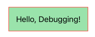
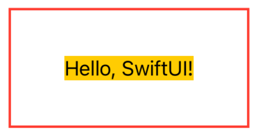
A straightforward method to identify layout problems is by applying borders or backgrounds to views. For instance, using .border(Color.red) outlines a view with a red border, making it easy to see its boundaries. Alternatively, .background(Color.green.opacity(0.5)) fills the view’s background with a semi-transparent green color, allowing you to observe overlapping or misaligned elements. These visual cues can quickly reveal issues such as unintended spacing or incorrect alignment.
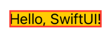
Text("Hello, Debugging!")
  .padding()
  .background(Color.green.opacity(0.5))
  .border(Color.red)
Unlocking Xcode Previews
Xcode’s live preview feature is invaluable for SwiftUI development. It enables real-time rendering of your UI, allowing you to see changes instantly. This approach helps in identifying layout issues across various scenarios without running the app on a device or simulator.
#Preview {
    Text("Hello, Debugging!")
      .padding()
      .background(Color.green.opacity(0.5))
      .border(Color.red)
}
By chaining .previewLayout and .padding, you can focus on specific areas of your layout. This makes it easier to spot alignment issues or clipping.
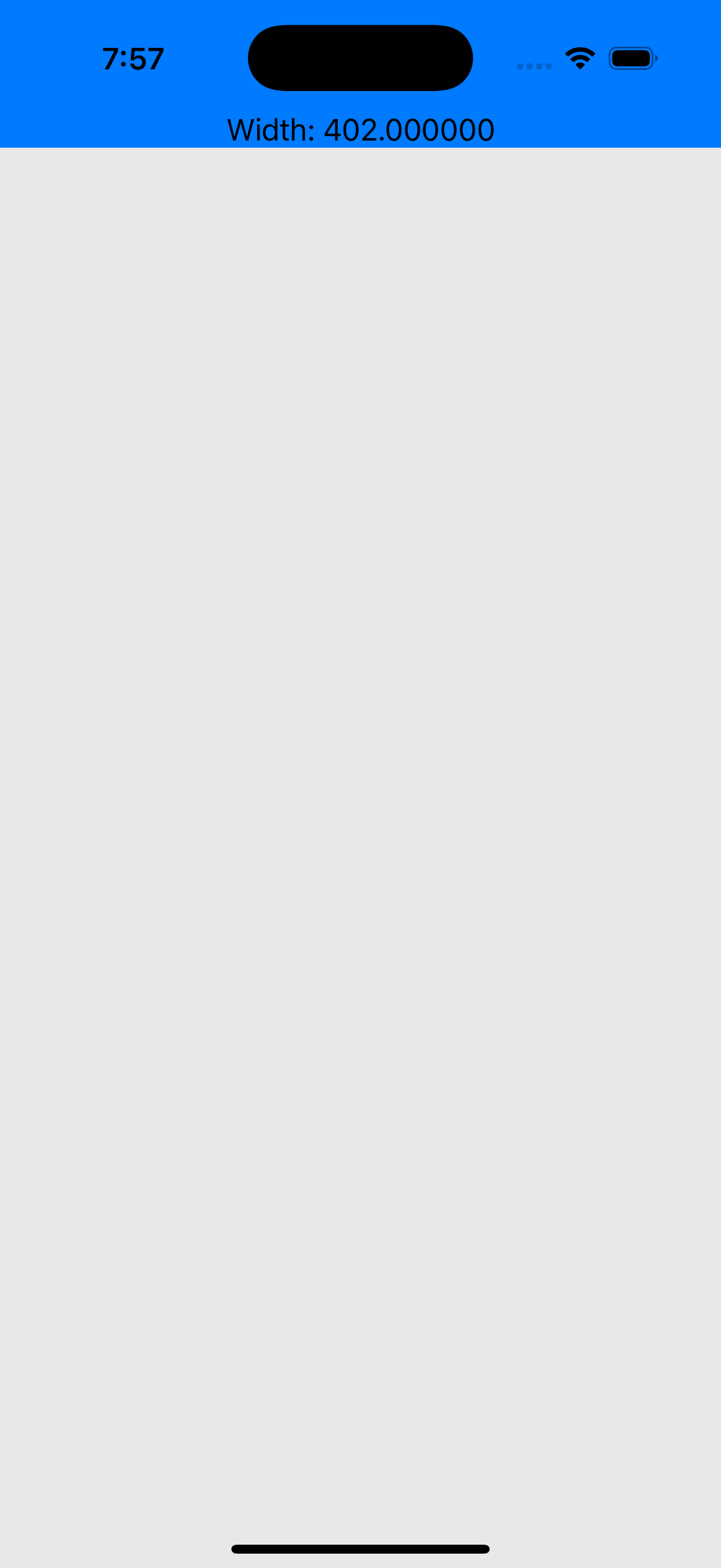
GeometryReader: Your Secret Weapon
GeometryReader is a powerful tool for accessing a view’s size and position within its parent. By embedding a view inside a GeometryReader, you can obtain its dimensions and adjust its layout accordingly. This is particularly useful for creating responsive designs and understanding how views adapt to different screen sizes. However, use GeometryReader judiciously, as improper usage can lead to complex and hard-to-maintain code.
struct DebugView: View {
    var body: some View {
        GeometryReader { geometry in
            Text("Width: \(geometry.size.width)")
                .frame(maxWidth: .infinity)
                .background(Color.blue)
        }
        .background(Color.gray.opacity(0.2))
    }
}
Conditional Debugging Modifiers
Sometimes you want to debug without permanently altering your UI code. Enter custom conditional modifiers.
import SwiftUI

struct DebugBorder: ViewModifier {
  let isActive: Bool

  func body(content: Content) -> some View {
    if isActive {
      content.border(Color.red)
    } else {
      content
    }
  }
}

extension View {
  func debugBorder(isActive: Bool) -> some View {
    self.modifier(DebugBorder(isActive: isActive))
  }
}
Now you can debug selectively:
Text("Hello, Debugging!")
  .debugBorder(isActive: true)
Mastering the Layout System
SwiftUI determines the size and position of views in a two-phase layout process: measurement and positioning.
Measurement Phase
- Each parent view proposes a size to its child views. This proposal often includes constraints, such as a maximum width or height.
- Each child responds by calculating and reporting back its preferred size.
- Example: If a HStack contains three Text views, the HStack proposes a size for each child based on its available space. Each Textview calculates its size based on its content and responds with its preferred size.
Positioning Phase
- The parent aligns and arranges its children based on alignment guides, modifiers, or its own layout rules.
- Example: In a VStack with alignment: .center, the parent centers each child horizontally within its bounds after gathering their sizes.
This two-phase system ensures flexibility but can lead to confusion when modifiers alter the layout unexpectedly. For instance, using .frame() modifies the size a view reports during measurement, which can affect its position during the second phase.
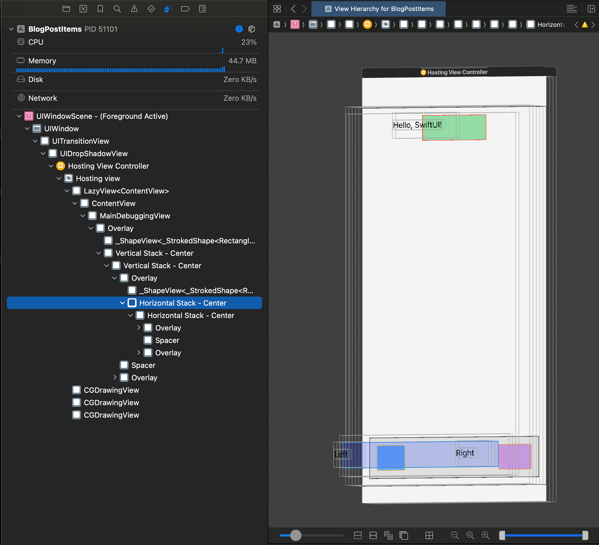
Debugging in Action: Building a Simple Layout Tool
Here’s a practical example that combines these techniques. We’ll build a layout that visualizes view boundaries, helping you debug alignment and spacing issues.
import SwiftUI
struct MainDebuggingView: View {
var body: some View {
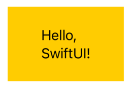
VStack {
Text("Hello, SwiftUI!")
.padding()
.background(Color.green.opacity(0.5))
.border(Color.red)
Spacer()
HStack {
Text("Left")
.padding()
.background(Color.blue.opacity(0.5))
.border(Color.yellow)
Spacer()
Text("Right")
.padding()
.background(Color.purple.opacity(0.5))
.border(Color.orange)
}
.padding()
.background(Color.gray.opacity(0.2))
.border(Color.black)
}
.padding()
.background(Color.gray.opacity(0.1))
.border(Color.black)
}
}
#Preview {
MainDebuggingView()
}
This layout includes labeled borders and backgrounds for every major view, making it easy to see how they interact. Adjust the spacers and paddings to observe how they influence the overall structure.
Mastering the SwiftUI Layout System
Debugging layouts isn’t just about fixing issues — it’s about understanding how SwiftUI works. Remember, SwiftUI’s layout system is based on a two-pass process:
-
The parent proposes a size to its child views.
-
The child decides its size and reports back to the parent.
This can lead to unexpected behavior if a child’s size doesn’t align with its parent’s expectations. Use the techniques we’ve covered to inspect and refine your layouts.
Debugging with View Hierarchies
When you need to dive deeper, Xcode’s Debug View Hierarchy is your best friend. It provides a 3D visualization of your app’s UI, showing how views are layered and nested. Use this tool to:
- Find hidden views occupying unexpected space.
- Debug alignment issues within stacks.
- Identify overlapping views caused by incorrect zIndex usage.
Activate the Debug View Hierarchy while running your app, and you’ll get a comprehensive picture of your layout.
Analyzing Layout with Instruments
Xcode’s Instruments tool offers performance analysis, including layout rendering times. By profiling your app, you can detect views that are expensive to render or cause layout delays. This information is crucial for optimizing performance and ensuring a smooth user experience. Regularly profiling your app helps in maintaining efficient layouts and identifying potential bottlenecks.
Examples for Common Layout Issues in SwiftUI
Let’s dive into practical examples for each of the three common culprits: ambiguous frames, incorrect alignment guides, and conflicting modifiers.
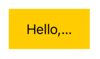
Ambiguous Frames
- Occurs when views have insufficient constraints to determine their size.
Example: A Text view placed inside a ZStack without a .frame() may appear unexpectedly sized because ZStack doesn’t impose a size by default.
import SwiftUI

struct AmbiguousFrameExample: View {
  var body: some View {
    ZStack {
      Text("Hello, SwiftUI!")
        .background(Color.yellow)
    }
    .border(Color.red, width: 2)
  }
}

#Preview {
  AmbiguousFrameExample()
}
- The ZStack does not impose a size on its child views.
- The Text view only takes up the space required to render its content.
- The ZStack collapses to the size of its content, making its border snug around the Text.
Fix: Use explicit size modifiers like .frame(width: 100, height: 50) or provide context by wrapping in a parent view (e.g., HStackor VStack).
var body: some View {
  ZStack {
    Text("Hello, SwiftUI!")
      .background(Color.yellow)
  }
  .frame(width: 200, height: 100) // Set explicit size for the ZStack
  .border(Color.red, width: 2)
}
- The ZStack now has a size of 200x100 points.
- The Text is displayed within the ZStack, and the red border clearly defines the new dimensions of the ZStack.
Incorrect Alignment Guides
• Misaligned views often result from misunderstanding how alignment guides work.
Example: In a VStack with alignment: .leading, children are aligned to the leading edge, but if one child uses .alignmentGuide(.leading) to offset itself, it may create unexpected gaps.
struct MisalignedVStackExample: View {
  var body: some View {
    VStack(alignment: .leading) {
      Text("Aligned to Leading")
        .background(Color.yellow)

      Text("Offset from Leading")
        .alignmentGuide(.leading) { _ in -30 } // Custom alignment guide offsets this view by 30 points
        .background(Color.green)

      Text("Also Aligned to Leading")
        .background(Color.blue)
    }
    .frame(width: 200)
    .border(Color.red, width: 2) // Border around the VStack for visual debugging
  }
}

#Preview {
  MisalignedVStackExample()
}
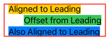
- The VStack has an alignment of .leading, so its children are expected to align to the leading edge.
- However, the second Text (“Offset from Leading”) introduces a custom alignment guide that offsets it 30 points to the right.
- This creates a visual gap between the first and third Text views and the second one.
Fix: Verify your alignment guides and remove unnecessary customizations unless needed.
var body: some View {
  VStack(alignment: .leading) {
    Text("Aligned to Leading")
      .background(Color.yellow)

    Text("Offset from Leading")
      .background(Color.green)

    Text("Also Aligned to Leading")
      .background(Color.blue)
  }
  .frame(width: 200)
  .border(Color.red, width: 2) // Border around the VStack for visual debugging
}
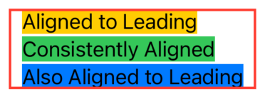
- Now all the children are aligned to the leading edge without unexpected gaps.
Conflicting Modifiers
- Applying conflicting modifiers can lead to unintended behavior.
Example: Combining .padding() and .frame() can create unexpected spacing, especially if the frame size conflicts with the padding.
import SwiftUI

struct ConflictingModifiersExample: View {
  var body: some View {
    Text("Hello, SwiftUI!")
      .padding(20) // Adds padding around the text
      .frame(width: 100, height: 50) // Forces a specific size
      .background(Color.yellow) // Highlight the frame size
  }
}

#Preview {
  ConflictingModifiersExample()
}
- The padding(20) adds 20 points of space around the Text, increasing the overall size.
- The subsequent .frame(width: 100, height: 50) forces the view into a specific size of 100x50 points.
- The result is a clipped or visually inconsistent layout, as the padding and frame sizes conflict.
Fix: Review the order and logic of your modifiers. Place .frame() before .padding() when the frame should define the size before padding is applied.
var body: some View {
  Text("Hello, SwiftUI!")
    .frame(width: 100, height: 50) // Forces a specific size
    .padding(20) // Adds padding around the text
    .background(Color.yellow) // Highlight the frame size
}
- The .frame(width: 100, height: 50) sets the dimensions of the Text.
- The .padding(20) adds 20 points of space around the frame.
- The total view size is now 140x90 (100 + 20 + 20 for width and 50 + 20 + 20 for height), and everything is displayed consistently.
.padding() before .frame() Padding affects the content size, then the frame clips or compresses it, causing unexpected spacing or clipping.
.frame() before .padding() Frame defines the base size, and padding adds space outside the frame for consistent and expected behavior.
Conclusion
Debugging SwiftUI layouts doesn’t have to be daunting. By leveraging tools like #Preview, borders, and Xcode’s Debug View Hierarchy, you can gain clarity on even the trickiest issues. These techniques have saved me countless hours, and they often come up in technical interviews — so mastering them is a double win.
If you want to learn more about native mobile development, you can check out the other articles I have written here: https://medium.com/@wesleymatlock
🚀 Happy coding! 🚀
By Wesley Matlock on November 25, 2024.
Exported from Medium on May 10, 2025.