Dropdown menus are a fundamental part of user interfaces in iOS applications, allowing users to select from a list of options efficiently…
Creating Advanced Dropdown Menus in SwiftUI
Dropdown menus are a fundamental part of user interfaces in iOS applications, allowing users to select from a list of options efficiently. SwiftUI, Apple’s declarative framework for building UIs, provides a versatile set of tools to create dropdown menus with varying levels of complexity and customization. This blog post dives deep into creating advanced dropdown menus using SwiftUI, covering everything from basic implementations to advanced menus with animations, multi-selection, and search functionalities.
Overview of Dropdown Menus in SwiftUI
SwiftUI offers several ways to create dropdown menus. Depending on the complexity and interactivity you need, you can choose from a basic built-in component or create a more customized experience using various SwiftUI tools. Below, we explore different types of dropdown menus:
-
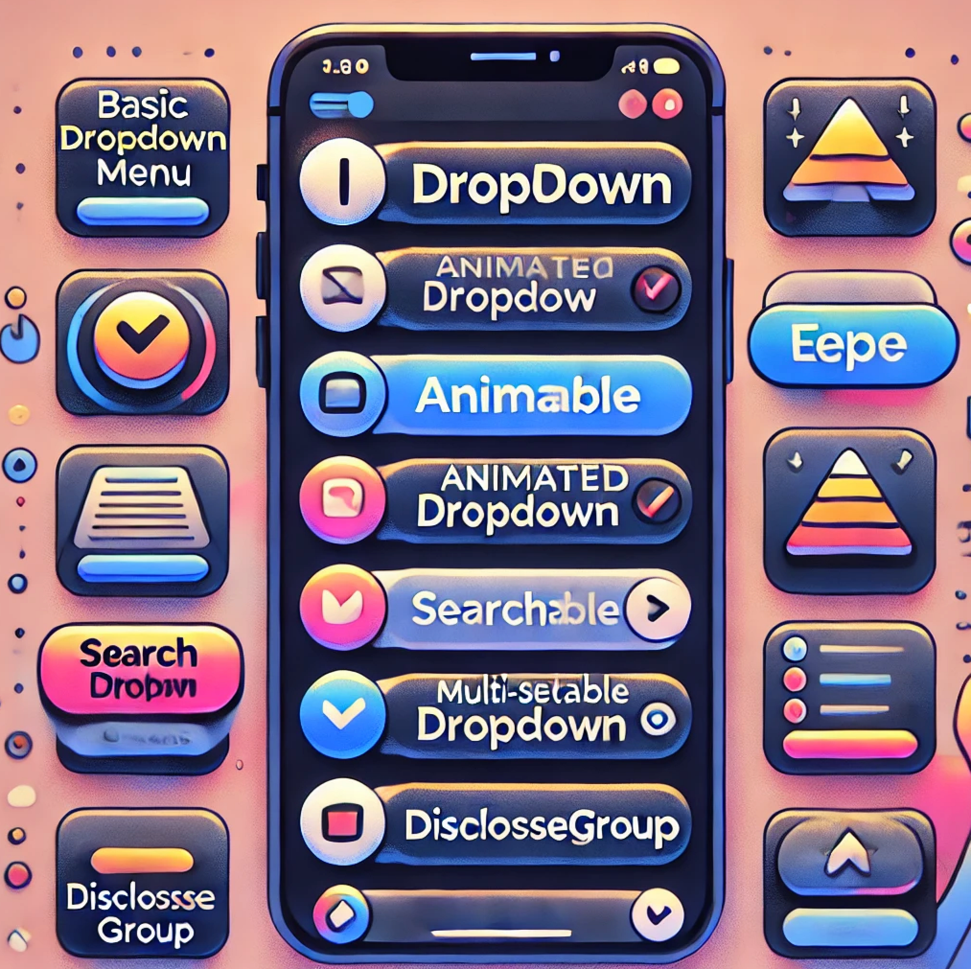
Basic Dropdown Menu Using SwiftUI’s Menu
-
Animated Dropdown Menu with Custom Button and Animations
-
Searchable Dropdown Menu
-
Multi-Select Dropdown Menu
-
Dropdown with DisclosureGroup
Each type of dropdown menu has its own use cases, advantages, and customization options. Let’s go through each of them in detail.
1. Basic Dropdown Menu Using SwiftUI’s Menu
The simplest and most straightforward way to create a dropdown menu in SwiftUI is by using the built-in Menu component. This component is part of SwiftUI and provides a basic dropdown without much customization.
import SwiftUI

struct BasicDropdownMenu: View {
  @State private var selectedOption: String = "Select an Option"

  var body: some View {
    Menu {
      Button("Option 1", action: { selectedOption = "Option 1" })
      Button("Option 2", action: { selectedOption = "Option 2" })
      Button("Option 3", action: { selectedOption = "Option 3" })
    } label: {
      Label(selectedOption, systemImage: "chevron.down")
        .padding()
        .background(Color.blue.opacity(0.1))
        .cornerRadius(8)
    }
  }
}

#Preview {
  BasicDropdownMenu()
}
Key Features:
- Simplicity: Easy to implement and ideal for standard dropdown use cases.
- Customization Limitations: Minimal control over appearance; primarily limited to modifying labels and actions.
- Built-in Components: Utilizes SwiftUI’s built-in Button and Label components.
Use Cases:
- Suitable for straightforward dropdown menus where minimal customization is needed.
- Perfect for quick prototyping or basic applications that follow standard UI patterns.

2. Animated Dropdown Menu with Custom Button and Animations
If you want more control over the dropdown’s behavior, appearance, and animations, using a custom Button with withAnimation allows for a more interactive and visually engaging experience.
import SwiftUI

struct AnimatedDropdownMenu: View {
  @Namespace private var animationNamespace
  @State private var isExpanded = false
  @State private var selectedOption = "Select an Option"
  let options = ["Option 1", "Option 2", "Option 3"]

  var body: some View {
    VStack {
      Button(action: {
        withAnimation(.spring()) {
          isExpanded.toggle()
        }
      }) {
        HStack {
          Text(selectedOption)
          Spacer()
          Image(systemName: isExpanded ? "chevron.up" : "chevron.down")
        }
        .padding()
        .background(Color.blue.opacity(0.1))
        .cornerRadius(8)
        .matchedGeometryEffect(id: "dropdown", in: animationNamespace)
      }

      if isExpanded {
        VStack {
          ForEach(options, id: \.self) { option in
            Text(option)
              .padding()
              .frame(maxWidth: .infinity, alignment: .leading)
              .background(Color.white)
              .onTapGesture {
                withAnimation(.spring()) {
                  selectedOption = option
                  isExpanded = false
                }
              }
              .matchedGeometryEffect(id: "dropdown-\(option)", in: animationNamespace)
          }
        }
        .background(Color.gray.opacity(0.1))
        .cornerRadius(8)
        .transition(.scale)
      }
    }
    .padding()
  }
}

#Preview {
    AnimatedDropdownMenu()
}
Key Features:
- Custom Animations: Smooth transitions between expanded and collapsed states using withAnimation.
- Flexible Styling: Full control over the dropdown’s appearance, including colors, fonts, and spacing.
- Expandable and Collapsible: Allows for dynamic content that changes based on user interactions.
Use Cases:
- Best suited for dropdown menus that require specific design requirements and enhanced interactivity.
- Ideal for creating more engaging UIs with smooth animations and transitions.

3. Searchable Dropdown Menu
The Searchable Dropdown Menu enhances user experience by providing a search bar to filter options within the dropdown. This is particularly useful when dealing with long lists of options.
import SwiftUI

struct SearchableDropdownMenu: View {
  @State private var isExpanded = false
  @State private var selectedOption = "Select an Option"
  @State private var searchText = ""
  let options = ["Apple", "Banana", "Orange", "Mango", "Pineapple", "Grapes"]

  var filteredOptions: [String] {
    if searchText.isEmpty {
      return options
    } else {
      return options.filter { $0.lowercased().contains(searchText.lowercased()) }
    }
  }

  var body: some View {
    VStack {
      Button(action: { isExpanded.toggle() }) {
        HStack {
          Text(selectedOption)
          Spacer()
          Image(systemName: isExpanded ? "chevron.up" : "chevron.down")
        }
        .padding()
        .background(Color.blue.opacity(0.1))
        .cornerRadius(8)
      }

      if isExpanded {
        VStack {
          TextField("Search...", text: $searchText)
            .textFieldStyle(RoundedBorderTextFieldStyle())
            .padding()

          ForEach(filteredOptions, id: \.self) { option in
            Text(option)
              .padding()
              .onTapGesture {
                selectedOption = option
                isExpanded = false
              }
          }
        }
        .background(Color.white)
        .cornerRadius(8)
        .shadow(radius: 5)
      }
    }
    .padding()
  }
}
#Preview {
    SearchableDropdownMenu()
}
Key Features:
- Search Functionality: Includes a TextField for filtering options based on user input.
- Dynamic Filtering: Updates the list of options in real-time as the user types.
- Interactive UI: Combines a dropdown with a search bar, providing a seamless search experience.
Use Cases:
- Perfect for forms or selection fields with a large number of options.
- Ideal for situations where users need to quickly find specific items, such as selecting a country or category.

4. Multi-Select Dropdown Menu
In some scenarios, users need the ability to select multiple options from a dropdown. The Multi-Select Dropdown Menu offers this functionality with an intuitive UI using checkmarks or toggles.
import SwiftUI

struct MultiSelectDropdownMenu: View {
  @State private var isExpanded = false
  @State private var selectedOptions: Set<String> = []
  let options = ["Swift", "Kotlin", "JavaScript", "Python", "Ruby"]

  var body: some View {
    VStack(alignment: .leading) {
      Button(action: { isExpanded.toggle() }) {
        HStack {
          Text(selectedOptions.isEmpty ? "Select Options" : selectedOptions.joined(separator: ", "))
          Spacer()
          Image(systemName: isExpanded ? "chevron.up" : "chevron.down")
        }
        .padding()
        .background(Color.blue.opacity(0.1))
        .cornerRadius(8)
      }

      if isExpanded {
        VStack {
          ForEach(options, id: \.self) { option in
            HStack {
              Text(option)
              Spacer()
              if selectedOptions.contains(option) {
                Image(systemName: "checkmark")
              }
            }
            .padding()
            .onTapGesture {
              if selectedOptions.contains(option) {
                selectedOptions.remove(option)
              } else {
                selectedOptions.insert(option)
              }
            }
          }
        }
        .background(Color.white)
        .cornerRadius(8)
        .shadow(radius: 5)
      }
    }
    .padding()
  }
}
#Preview {
  MultiSelectDropdownMenu()
}
Key Features:
- Multiple Selection: Allows users to select more than one option using a set of checkmarks.
- Visual Feedback: Provides visual cues for selected options, enhancing usability.
- Interactive Elements: onTapGesture enables users to interactively select or deselect options.
Use Cases:
- Great for forms, surveys, or settings screens where multiple selections are needed.
- Suitable for scenarios where users need to enable or disable multiple features.
5. Dropdown with DisclosureGroup
SwiftUI’s DisclosureGroup component offers a native way to create expandable and collapsible views, perfect for dropdown menus that need a built-in expand/collapse mechanism without additional animation handling.
import SwiftUI

struct DropdownMenuDisclosureGroup: View {
  @State private var isExpanded: Bool = false
  @State private var selectedOption: String = "Select an Option"
  let options = ["Option 1", "Option 2", "Option 3"]

  var body: some View {
    DisclosureGroup(selectedOption, isExpanded: $isExpanded) {
      VStack {
        ForEach(options, id: \.self) { option in
          Text(option)
            .padding()
            .onTapGesture {
              selectedOption = option
              isExpanded = false
            }
        }
      }
    }
    .padding()
    .background(Color.gray.opacity(0.1))
    .cornerRadius(8)
  }
}
#Preview {
  DropdownMenuDisclosureGroup()
}
Key Features:
- Built-in Expand/Collapse Functionality: DisclosureGroup automatically manages the expand and collapse states, making it straightforward to use.
- Compact and Clean Design: The component’s native look and feel make it suitable for applications that require a consistent and minimalistic UI.
- Simple to Implement: Requires minimal code and leverages SwiftUI’s native handling of state changes.
- Customizable Content: While the expand/collapse mechanism is built-in, the content inside the DisclosureGroup can be fully customized to match the app’s design.
Use Cases:
- Forms and Settings: Ideal for settings screens, forms, or filter panels where you need to group related options under a collapsible section.
- Hierarchical Data Display: Useful for showing hierarchical data or nested options, such as categories and subcategories.
- Space-Saving UI Elements: Perfect for situations where you need to save space on the screen and provide more information upon user interaction.

Conclusion
SwiftUI offers multiple ways to create dropdown menus, ranging from basic to highly customized implementations. Understanding the unique features and use cases of each type of dropdown menu helps developers choose the most appropriate approach for their application’s needs. Here’s a quick summary to help guide your decision:
1. Basic Dropdown Menu Using Menu: Ideal for simple and straightforward dropdowns where minimal customization is needed. It is easy to implement but offers limited styling options.
2. Animated Dropdown Menu with Custom Button and Animations: Best for creating interactive and visually appealing dropdowns with smooth animations. This approach provides full control over styling and behavior, making it suitable for more dynamic and engaging user interfaces.
3. Searchable Dropdown Menu: Perfect for use cases where users need to filter and search through a large list of options. It combines a search field with a dropdown, offering a more user-friendly experience for applications with extensive data sets.
4. Multi-Select Dropdown Menu: Ideal for scenarios where multiple selections are necessary, such as settings screens or multi-choice forms. It provides an intuitive way for users to select multiple options and gives clear visual feedback.
5. Dropdown with DisclosureGroup: Great for creating native-looking expandable menus with minimal code. It’s suitable for hierarchical data displays or scenarios where space is limited, and a native expand/collapse component is required.
By leveraging these different dropdown menu techniques, you can create highly customized, intuitive, and visually compelling UIs that provide a great user experience. SwiftUI’s flexibility and rich set of components make it easy to tailor these menus to fit any app’s unique requirements. Whether you need simplicity, interactivity, multi-selection, or search capabilities, SwiftUI has the tools to help you build it.
If you want to learn more about native mobile development, you can check out the other articles I have written here: https://medium.com/@wesleymatlock
🚀 Happy coding! 🚀
By Wesley Matlock on September 5, 2024.
Exported from Medium on May 10, 2025.