Most running apps give you an average heart rate. “Nice job, your heart rate was 148 BPM.” Cool. But where on the run did you start to suffer? Where did your body shift into overdrive?
That’s what this post is all about: turning flat stats into full-color storytelling. We’re building a MapKit-based heatmap using HealthKit heart rate samples, syncing them with your GPS route to show exactly where you were chillin’ (blue) and where you were flirting with the blackout gods (red).
This system is a core part of a new app I’m working on called WorkoutRoutes — more on that soon. For now, we’re focusing on the heart of it: precise HealthKit sync, clean SwiftUI, and fast rendering with ~50 smart segments.
🫶 Quick thing before we keep going: If this post helps you rethink how to visualize heart rate data, smashing that 👏 button (you can hit it up to 50 times!) gets it in front of more iOS devs. Much appreciated.
💡 The Problem with Averages
A single number can’t capture your effort over time. You could coast downhill at 130 BPM and then hit 190 BPM on the final hill, but all the app shows is “average: 150.”
We need context. And that means mapping your heart rate onto your GPS data with time correlation.
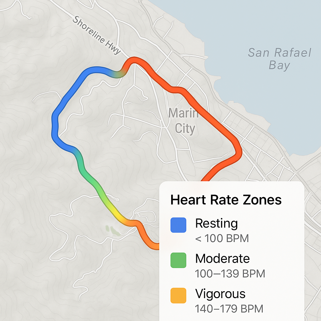
🫀 Heart Rate Zones 101
First up, define your heart rate zones. Here’s a simple system we’re using:
enum WorkoutHeartRateZone: CaseIterable, Identifiable {
    case resting // < 100 BPM
    case moderate // 100-139 BPM
    case vigorous // 140-179 BPM
    case maximum // 180+ BPM

    var color: Color {
        switch self {
        case .resting: return .blue
        case .moderate: return .green
        case .vigorous: return .orange
        case .maximum: return .red
        }
    }
    var range: ClosedRange<Double> {
        switch self {
        case .resting: return 0...99
        case .moderate: return 100...139
        case .vigorous: return 140...179
        case .maximum: return 180...300
        }
    }
    static func from(heartRate: Double) -> WorkoutHeartRateZone {
        allCases.first(where: { $0.range.contains(heartRate) }) ?? .resting
    }
}
🔐 HealthKit Authorization and Data Fetching
HealthKit gives us heart rate samples and GPS routes, but they live in separate APIs. First, request access:
func requestAuthorization() async throws {
    var typesToRead: Set = [
        HKObjectType.workoutType(),
        HKSeriesType.workoutRoute()
    ]

    if let heartRateType = HKQuantityType.quantityType(forIdentifier: .heartRate) {
        typesToRead.insert(heartRateType)
    }

    try await withCheckedThrowingContinuation { continuation in
        healthStore.requestAuthorization(toShare: nil, read: typesToRead) { success, error in
            if let error = error {
                continuation.resume(throwing: error)
            } else if success {
                continuation.resume()
            } else {
                continuation.resume(throwing: WorkoutDataError.authorizationFailed)
            }
        }
    }
}
Then fetch the heart rate samples for a workout:
func fetchHeartRateData(for workout: HKWorkout) async throws -> [HKQuantitySample] { ... }
We’ll map each sample’s timestamp to a segment of the GPS route in a moment.
⏱️ Timestamp Sync is Everything
This is where it gets tricky.
Heart rate and GPS data come in at different rates and aren’t guaranteed to line up perfectly. We correlate them using timestamps and the route’s recorded start/end times.
Each HeartRateSample struct looks like this:
struct HeartRateSample: Identifiable, Equatable {
    let id = UUID()
    let heartRate: Double
    let timestamp: Date
    let routeIndex: Int?

    var zone: WorkoutHeartRateZone {
        WorkoutHeartRateZone.from(heartRate: heartRate)
    }
}
🧩 Segment Generation Strategy
To keep MapKit rendering smooth, we break the route into about 50 segments:
let segmentSize = max(2, routeCoordinates.count / 50)
For each chunk, we find the average heart rate in that time range and map it to a zone + color:
let zone = WorkoutHeartRateZone.from(heartRate: avgHR)
let color = interpolateHeartRateColor(heartRate: avgHR, zone: zone)
🎨 Color Interpolation That Doesn’t Look Like Trash
We scale the color intensity based on how deep you are in a zone. A light orange isn’t the same as a full-blast red. This is how we add that feeling of intensity:
private static func interpolateHeartRateColor(heartRate: Double, zone: WorkoutHeartRateZone) -> Color {
    let range = zone.range
    let progress = (heartRate - range.lowerBound) / (range.upperBound - range.lowerBound)
    let opacity = max(0.4, min(1.0, 0.4 + (progress * 0.6)))
    return zone.color.opacity(opacity)
}
🗺️ MapKit Overlay Rendering
This is where it all comes together. Using MapKit in SwiftUI, we render the polyline segments:
MapPolyline(coordinates: segment.coordinates)
    .stroke(
        segment.color,
        style: StrokeStyle(
            lineWidth: 8,
            lineCap: .round,
            lineJoin: .round
        )
    )
Boom. Now you can see where you were flying and where your heart nearly quit.
🧰 SwiftUI Controls + Context Menus
Add a little UI to toggle the heatmap, present a selection sheet, or pick different heatmap types:
.sheet(isPresented: $heatMapState.isSelectionSheetPresented) {
    HeatMapSelectionSheet(heatMapState: heatMapState)
}
.contextMenu {
    Button("Heart Rate") { heatMapState.selectType(.heartRate) }
}
```swift

Use a simple animated button to flip the heat-map on/off with feedback:

```swift
AnimatedButton {
    heatMapState.toggleHeatMap()
} label: {
    Image(systemName: "map.fill")
}
🎛️ State Management with @Observable
Keep everything reactive and Swift 6–ready with this:
@Observable
@MainActor
final class HeatMapState {
    var isEnabled = false
    var currentType: HeatMapType = .heartRate
    var showLegend = true
    var isSelectionSheetPresented = false

    func toggleHeatMap() {
        isEnabled.toggle()
    }

    func selectType(_ type: HeatMapType) {
        currentType = type
        isEnabled = true
    }

    func reset() { ... }
}
🛠️ What’s Next: Cadence, Elevation, and WorkoutRoutes
This architecture isn’t just for heart rate. With minimal tweaks, you can extend this system to:
- Running cadence
- Elevation changes
- Pace consistency
- Even stress zones (with HRV)
All of this is going into my next app, WorkoutRoutes. It’s built for runners, walkers, cyclist, or who want more than just “how far” and “how fast.” I want to show them how their body felt.
Stay tuned for that.
🎯 Bonus: More Real-World iOS Survival Stories
If you’re hungry for more tips, tricks, and battle-tested SwiftUI stories, swing by my full collection: https://medium.com/@wesleymatlock.
These posts are packed with real-world solutions, some laughs, and the kind of Swift code that doesn’t scream in Instruments. Let’s keep building apps that rock — and if you’ve got stories of your own, drop me a line. I’d love to hear from you.
👊 Wes